BOW A2: Proof final

Have lifted the tones/darks.

Converted whole doc. to greyscale in Adobe preflight, thanks to ExWHyZed showing me how to.

Noticed the darks losing some white again. Must go back to a couple of images and lighten further.

I have adjusted the text and added an image to the inside of the front cover.

Made some further minor adjustments after friend subbed and others made final comments.

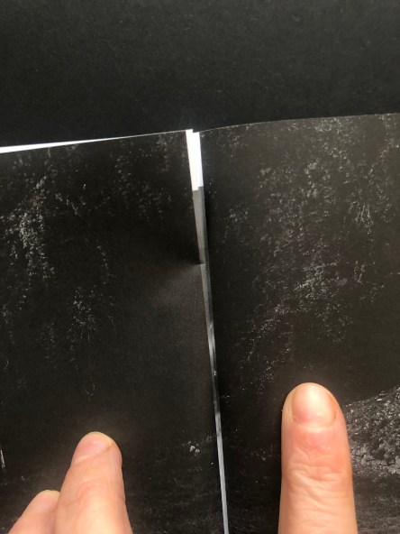
Spread No. 18 needs adjusting as its corresponding page spread No. 9 has white on the edges and it peeks through. Need to resolve. May do by putting it in the same sized frames. Have learned sometimes, sequence dictated in part by practicalities.

Screen Shot 2020-04-03 at 16.22.15

After making some changes – thinking about how the opposite pages will behave as you flip through. this family too – A5 Final online [2001x]

BOW A2: Zine proof

Seeing the proof has been very helpful. There are several things I need to adjust:

  • Sequence – I’ve shifted the images so the center spread is now a single image, full-bleed. The way it was before, the right-hand side was blank, so that when you turned to two pages later, you came to a dark double-spread, full-bleed which was interrupted by a slight bit of the middle spread’s whiteness peeking through. I think the double spread in the center will be best and it also solves that very slight intrusion. I’m not sure I’ll catch all of these but would prefer to: if there’s a double-page spread then the corresponding printed page earlier or later in the book needs to be dark. The centre one is fine now – it’s the football posts (before it was the eye looking up). I’ve not noticed it anywhere else. There are three full-bleed double-page spreads to watch out for.

IMG_3708


  • Sequence, I am looking again at the sequence, having shifted things as above, some other pairings might have been lost and will need addressing. Currently, it’s like this – after shifting the centre.

    Screen Shot 2020-04-02 at 14.59.33

  • I need to address what to do with the text. I have tried it on the first two pages but then the book had to shrink from its original size  – it’s now a standard A5. So it didn’t fit as was and I spread the text over three pages, (actual page numbers, not spreads as numbered above) P5 – text only, P6 image and text, P8 had a tiny piece of text and image on right-hand side page –  waving goodbye or hello) But then that seemed messy and I squeezed it in so back to P5, and P6. But I am not satisfied with the layout and am looking at other options.
  • P2 is blank – inside cover, but the back inside cover isn’t – due to the page limit. I think that means P2 should have a small image on it or maybe solve the problem of the text and try to have it on the inside cover with less blank space. I mentioned this yesterday and everyone said, no, keep the inside cover blank – but I am not certain. As the inside back cover has print on it, I feel the inside front should too. The alternative is to remove a spread and free up space in the book of 40 pages (limit with this stapled book from ExWhyZed) and have blank inside covers at both ends but this is a zine, not a book so print on the inner covers is fine.
  • Some of the images, as I knew, need to be lightened but the difference on the screen and paper is quite stark so I have asked if there is a print profile for this particular paper – I didn’t see one before  – but I’d like to be more certain of the how the darks are going to behave. I’m sure they must have these but there was no mention of them, perhaps they want to keep things easy for people or perhaps I just missed the bleeding obvious, as is my wont. Am waiting to hear.