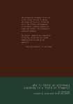
BOW A5: Print queries and responses

I have copied and pasted the book over into a slightly bigger size. Originally it was A4. Now it is a few mm taller.  I have written to a couple of printers asking about cost as I know all my ideas will pile on the costs and if I go for half pages and different sized pages, it can’t just be ordered as a standard book from a digital book print company using their templates. However, I do recall Milk saying in their website they do handmade publications so maybe worth inquiring – although it seems nuts to ask an Australian company when there are plenty here. I am also aware that this activity pre-empts SYP but the design is integral to the overall concept so I can’t really separate it out. Scroll down for responses.

Here is an extract of my inquiry (included here, not least because some of the concepts are outlined succinctly):

I am working on my final Body of Work (BOW) project. It is not finished but I need to start thinking about how much money it will cost to produce, what is realistic and what might be impossible.

[…]

It is slightly over A4 and the design is based on some Situationist Times publications (see video)

These publications had vertical and horizontal 3/4 or 1/2 pages and I have included those too in my work for now.

I am also thinking about the sort of maths exercise books with graph paper from my school days as an influence. Coding and decoding reality using mathematical formulas should subtly weave its way through the work.

I would ideally like different textured paper for text (there are four pages of text inserted) like they have in a FOAM publication.

I think of the work as a bunch of signifiers behaving like rowdy children.

At the moment, there are coloured blocks which might indicate paper colour rather than ink. Please advise me about this.

I’d love to hear your thoughts, suggestions and warnings.

I have had one response so far:

Thanks for the artwork and email.  It is a very ambitious publication and will need plenty of time to finetune and get perfect from an artwork then a production point of view.
So, picking through the points, is the finished publication 310x216mm with a total of 48 pages?  4+44pp?
Are you able to send over a video of a mock-up please?  The pdf is great but really doesn’t show which pages fold in which direction
Page 8 is a fold-out? If this folds out then page 9 should be with same width because it backs up to it?  Same with 14, the next page has to be the same size?
If you can make a mock-up you’ll see the mechanics that you need to consider with the actual paper.
From a cost point of view, having the height at 310mm means the print costs will be double what they would at A4 (297mm).  We can use GF Smith Colorplan for the coloured papers but these will adds £100s more to the total cost in comparison with printing the colour on our white ‘house’ sheet.

This answers some questions – I have replied:

I will need to put something together this weekend or early next week to send over as a video.
I am very happy to use A4 (I had a feeling that might be the case and, in fact, I think there absolutely must be some conventional standardised structure to contain the non-standardised erratic stuff.)
I was also certain ink rather than paper colour would be cheaper so when you give me a rough idea of costs, please go with the more affordable option.
Further answers from me:
This [the video and dummy I made] is all VERY rough indeed but it was a helpful exercise. I made this dummy with an inkjet printer, set to fastest print speed in mono – so it really is looking at the construction more than anything else.
As you might imagine, the sequence in my PDF is still totally up for reorganisation but the practical things that need to be fixed at this time should be – such as binding type, where the text pages and shadow puppets on half pages should go, and the gatefold construction. When I’ve done another edit, I will print a version at work on double-sided flyer paper in colour to get a much better idea and will send you a video of that once it’s ready. Below is a list of things that came out of making this dummy:
    • The book is probably not big enough to contain half vertical AND half horizontal pages. I will ditch the vertical half pages and stick only with the horizontal ones. (And a gatefold – see later)
    • The half pages should either all be in the middle of the text pages or should wrap the text pages which I think is my preference – the 4 text pages (2 x double-sided)  therefore interrupts the narrative of the shadow puppets. I have played with various options in the video.
    • (Does the above depend on whether its saddle stitch?  – and the text along with half pages being in the middle, which removes the possibility of a centre spread image – which may be fine.)
    • The text should be on a different textured paper if possible.
    • At the moment there is one gatefold. (Hope its all clear and evident in the video) I suspect that is sufficient in a book of this length. But when you give me a rough idea of cost, can you let me know what it would cost to include two, please.
    • (I also wonder what it might cost to have a gatefold that folds out for an additional page… so in the video, you will see when the spread opens out it contains 3 x A4 pages. What if it were four?)
    • I will stick with A4 rather than an alternative sizing – (this fits with the concept of classical and non-classical structure existing together and intermingling, setting up tensions between the two)
    • I will use ink where I want pages to be a different colour to avoid massively hiking up the price – but even that will be limited.
    • Saying that the cover pages might be best with a different paper as is usual  – although I used the same paper for the zine to keep costs down (recall the idea of the school-like maths exercise book being an inspiration for this work)
    • I want to avoid the stark white paper photobooks are usually printed on. One of the examples you sent me before had used recycled paper. I like that idea  – and wondered, is it a bit creamy in its naked state?
    • If I do use ink to change the colour of any pages it should be on the whole spread so that if its on page 5 (inc. cover in numbering) in one half of the book it should also be that colour on page 36 (think that’s right!) – especially if it’s saddle stitch.
    • I think I may have seen 40 pages as the limit for that binding- maybe only in zines? I’ll await your guidance on that.

 

BOW A5: Lewis Bush book designing course

A couple of people had recommended the Lewis Bush online workshops to me recently. It feels serendipitous to have accessed this at exactly the moment I reached BOW A5, Presentation and Outcome. The course was held over four evenings, each class lasting roughly 1.5 hours.

Some key points I took away from the sessions:

  • We were given a handout at the end of the first sessions which asked key and precise questions about publication/project we were working on in terms of its content and concept. Answering the questions might have contributed towards taming months and even years of research and improvisation, the culmination of which is this project. Really helpful exercise.
  • Although not directly asked about this, the questions prompted me to I think about my way of working – I will need to talk about this for assessment. I did not go out and make a project about something very specific – coal mines of Abberwyswyth for instance. I could have done – I have the five-year ongoing project I have been making alongside the charity, Just Shelter. But I never had any intention of doing that – for so many reasons, both ethical and creative. Instead, I am continuing to work with the improvisational skills I learned throughout the 90s and beyond when acting and then teaching kids drama. When improvising, you start with an idea – and see where it goes, you don’t censor: you meander and explore and experiment, and over time, you collect and hone and begin to play with what emerges. I have never forgotten hearing how Canadian theatre director, Robert LePage begins his rehearsals. He asks his cast to get down on the floor and write out their dreams, fears, fantasies, anything – this freeing exercise not only disrupts the usual ‘sit down politely and read the script’ convention that usually happens on day one of a rehearsal, it is also a way of eliciting potential nuggets of narrative, images, ideas. It’s collaborative and physical and gets the performers contributing parts of themselves straight away. LePage and other directors I admire rely on improvisation and play – and that mindset is where I want to be with my work. I started with the idea of the ‘movies’ which had such an impact on how I see myself when I was growing up – and ‘language materials’  – and not much more. I had no idea where I would go with this work. In fact, this was mentioned in the L3 access interview – (roughly) ‘the proposal is interesting and well written, but until the last paragraph, I had no idea what you would be making work about’. The work still feels to me like it could be in the early stages, even though I will need to submit something for assessment. I have no idea if it will continue beyond the degree, but it could. (Clod Ensemble took ten years to create On The High Road) For now, it feels like an organic thing that has the energy to keep growing.
  • LB reiterated several times, do not censor yourself. I think this is something that cannot be understated and perhaps needs far more flagging within the OCA paradigm. (I say this because, while I have a very supportive cohort, often people look at me like I’m nuts when I share my work, and say things like – it’s a trip through your madness, which seems a trifle odd on an art degree.)
  • We were shown a lot of examples – many of which were incredibly relevant for me.

    https://mishkahenner.com/Astronomical
    https://www.christophernunn.co.uk/ukrainianstreetdogs

    http://karenzouaoui.com/b-s-johnson-society/

    BEYOND DRIFTING: IMPERFECTLY KNOWN ANIMALS Mary Barker – https://www.mandy-barker.com/books

    http://dayanitasingh.net/myself-mona-ahmed/ Lots of book objects – books on walls- we were shown something I can’t find on the website – but plenty of ideas here. Fantastic work.

    And I found this  – https://www.moma.org/collection/works/9628 this seems to be a big influence on https://www.kensukekoike.com

  • LB talked about a scale between content and concept. Some books, like Henner’s Astronomical, are highly conceptual as is much of his work – at the other end of the scale, the images mean more than the book and the form is secondary. An article by Alain de Botton popped into my feed in the same week I was doing the course, which seemed another but of serendipity – in which he discusses architecture and Modernism. He says, “As Modernism declared: ‘Form must follow function’ – in other words, the appearance of a building should never be shaped by a consideration for beauty; all that should matter is the basic material purpose” (2020) LB also discussed this ideal as we compared books – thinking about how form can potentially overpower function. (I don’t particularly agree with everything de Botton says in the article, although it may be accurate to suggest much of modernity is truly ugly, even grotesque –  the discussion is, nevertheless, relevant.) I wrote about architecture being a language material, as speech, images, and music all are too, in my L3 proposal. As is code. And it is interesting to consider ugliness and expression.  Both LB and de Botton prompt me to think about the choices I am making.
  • One of the most helpful things was to learn about grids – a concept in design that helps to contain your content. I wish I had known about this before – there are pros and cons, both practical and aesthetic when working with grids as I discovered yesterday while experimenting.  But knowing about grids has already had an impact on how I do things along with the results.

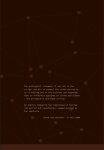
    Click on image to see full example. I was pleased when one of the people giving feedback for the BOW A2 zine noticed I had left text off the cover altogether. It really suited that zine and I like it too. Here, I wanted to experiment with having internal text on the cover as opposed to an image or title, or both of those. But as much as I like that idea, I am not sure it is the right option for this particular manifestation of this work now. However, there is still time and I am playing with options.  Even so, if I do go that route, I will use grids to explore how I do that.

  • Overall, there was lots of information which was invaluable such as bookbinding types and brief explanations about each of the different types of printers – inkjet, laser, digital and litho. For someone who has just muddled through, picking things up as I go, this was all very helpful. The course was also delivered in a coherent and easy to digest way.
  • In terms of concept vs. content, I thought about my work and where it is positioned. The concept is integral – although perhaps not quite as extreme as Henner’s above (but maybe it is….) It is in the very idea of a book’s existence, with images and text that are in a contest for attention (as they are nowadays), along with printing  – all language materials within the story of structuralism – which are fixed until uploaded and shared as coded material. And so the content is key – but it is not key that I took a series of beautifully made images. Rather, I have literally taken them from places such as old books, a found newspaper (actually found in the attic next to my son’s bedroom! Thank you to him) and rephotographed referencing Benjamin and countless others. What is key, is the entangled relationship between those images and texts, how they came about, along with me, the proprietary collaborator, potential viewers, and the containers they exist in. And that is also why the grids are so important here – they not only provide an internal skeleton for the work, they represent the internal skeleton of our reality and the theory of structuralism. This is why I really need to have an internet-based version/cousin of this work to accompany the publication. Of course, the images matter and are teeming with references and symbolism – but could ultimately have been any collection of images – i.e. I did not have to go to Aberyswyth and stand in a mine with my camera and make a body of work.
  • We also looked at text. It was good to see several examples of inserted text – at the end, in the middle, as a separate book, or a collection of separate books/pamphlets that could be read in any order. I am still thinking about the text which I have yet to write but for now, erring on a slightly different sized and textures paper within the book at some point. Having different paper and sized pages as a notion was further imprinted for me as an idea worth persuing when I began working with the Situationist magazines.
  • I have been inspired by the Situationist publications as discussed in late April. 
    This is not just an aesthetic choice (although the relationship between meaning and matter means it is hard to separate one from the other  – see my essay). It is also because DeBord and his crew were looking at reconstructing society altogether, as well as the developing science that has inevitably led to that happening, although not as they might have wished. They also explore the entanglement of time, history and culture as I am doing. Since the early iterations, especially when I made the tiny handmade dummy book, I have felt that different paper and material should be used, including gatefolds. I had the idea of signifiers running riot, having a party – I think I even wrote about them at a rave at the Acropolis (maybe when the Ai seemed high and then on some sort of comedown, that’s where it had been!) I have no idea how this will be paid for yet, but I am not censoring myself and just going with it. I will find solutions and come up with alternatives when needed. But I am aware that it could all become too ‘cute’. While listening to LB, I thought about the possibility of making the work in a maths exercise book like one I’d used at school in the 70s/80s, with actual graph paper (the whole graph paper thing ties in with the notion that reality can be decoded and therefore re-coded, see DEVS (BBC2)) which underpins the work. While I like this idea, aspects will inevitably be there, but to literally do this risks the ‘too cute’ thing I want to avoid. The choice of paper should suggest, hint and point to  – (as it does in the Situationist stuff) rather than overpower the concept.


I am now working on a version to send to printers for advice, estimates and warnings about what is not possible. I am extremely grateful to have had this excellent opportunity which will, hopefully, take the project into a different place. It was an invaluable experience and I’d definitely recommend others to try Lewis Bush’s courses out too. Fellow OCA Allan ONeill was also on the course and I look forward to chatting to him about it.

I must get the latest draft to printers so I can figure out how to go ahead, what can be done for BOW assessment, and what should be done in SYP. I then need to return to the essay to rewrite some bits, insert some stuff, remove etc. In the meantime, I have a pile of books next to me which I refer to as I edit and play with options including Pictures from Home (Sultan, Mack reprint), Foam Talent edition (2019), Soliquies and Soliloquies on Death (Martins) and several Situationist publications. I am also attending an online lecture on quantum science and decoding reality later this week, which is very exciting indeed!

BOW A5: Research content and presentation

  • I have a small handful of images that either need to be re-edited and/or made
  • The next stage is to write the text insert
  • And to approach a couple of printers for some advice (which I will do once I have done the first item and inserted them)
  • The LB course has been invaluable especially as I learned about grids https://www.canva.com/learn/grid-design/ and https://www.creativebloq.com/web-design/grid-theory-41411345 (Wish I’d been more aware of this before – it’s fantastic and is so relevant to my own work in terms of the structural theory it encapsulates. That being so, I suspect the thing for me is to have a tight grid that echoes the graph paper as the content is sporadic and chaotic – rhizome-like. A strict grid will hold it more securely. The best way to do this is to export a Package for ID and start working from that as it will take all the images (currently in a bit of a chaotic organically grown collection of files menu  – BOW A3/A4)

I have also seen a plethora of articles and tweets emerge in the last few days and weeks that express the dangers of some of the implications I have been trying to get at. That’s not to say this work is just about this particular moment (this week) but rather an ongoing moment  – ‘the contemporary condition’ .

In relation, Ruth suggested the following:

https://mitpress.mit.edu/books/hegel-after-occupy

https://www.sternberg-press.com/series/the-contemporary-condition-series/


Here are a couple of the links I mentioned earlier:

WHITEHALL ANALYTICA – THE AI SUPERSTATE: Part 1 – The Corporate Money Behind Health Surveillance

WHITEHALL ANALYTICA – THE AI SUPERSTATE: Part 2 – Is COVID-19 Fast-Tracking a Eugenics-Inspired Genomics Programme in the NHS?

Carole Cadwalladr (@carolecadwalla) Tweeted:
I can’t sleep so here’s a story in 4 screenshots. We first learned of new ‘Joint Biosecurity Centre’ on Sun. On Tues, that 4 friends of Gove/Cummings appointed to key roles in Cabinet Office. Today we learn ‘Biosecurity’ = counterterror/health mash-up. Based in Cabinet Office https://t.co/HPwqo8i5Xr
https://twitter.com/carolecadwalla/status/1260730061675802626?s=20

There are also plenty of articles about machine/ai ethics which are useful to think about

View at Medium.com