- Recent feedback posted here 28/09/20 – much appreciated as the fellow student who gave it actively requested to see the work and it gives me another opportunity to discuss my decision-making process:
I really liked the idea of this project. There is so much you could do with it. Perhaps that created the question of what to present? Yes, for sure – but I have to be really honest with myself and pick and choose elements that contribute to a clear and well-defined concept. If any object I’ve made does not do that, then it should not be submitted as an item within the BOW, but rather as something that might yet be developed within the blog/record of process. For instance, I was in two minds about submitting the sequence of images as individual pieces that can exist outside either of the publications – although I do believe they can and will do in an exhibition of sorts (probably online given COVID but that’s OK because it will be cheaper to do which is helpful.) But many students have reported that assessors want clarity and submitting the images separately would have confused matters. Am I submitting a publication (which can exist in two places) or a sequence of images? The answer is “I am submitting two versions of the same publication”. (see Fisher and Rubinstein quote below).
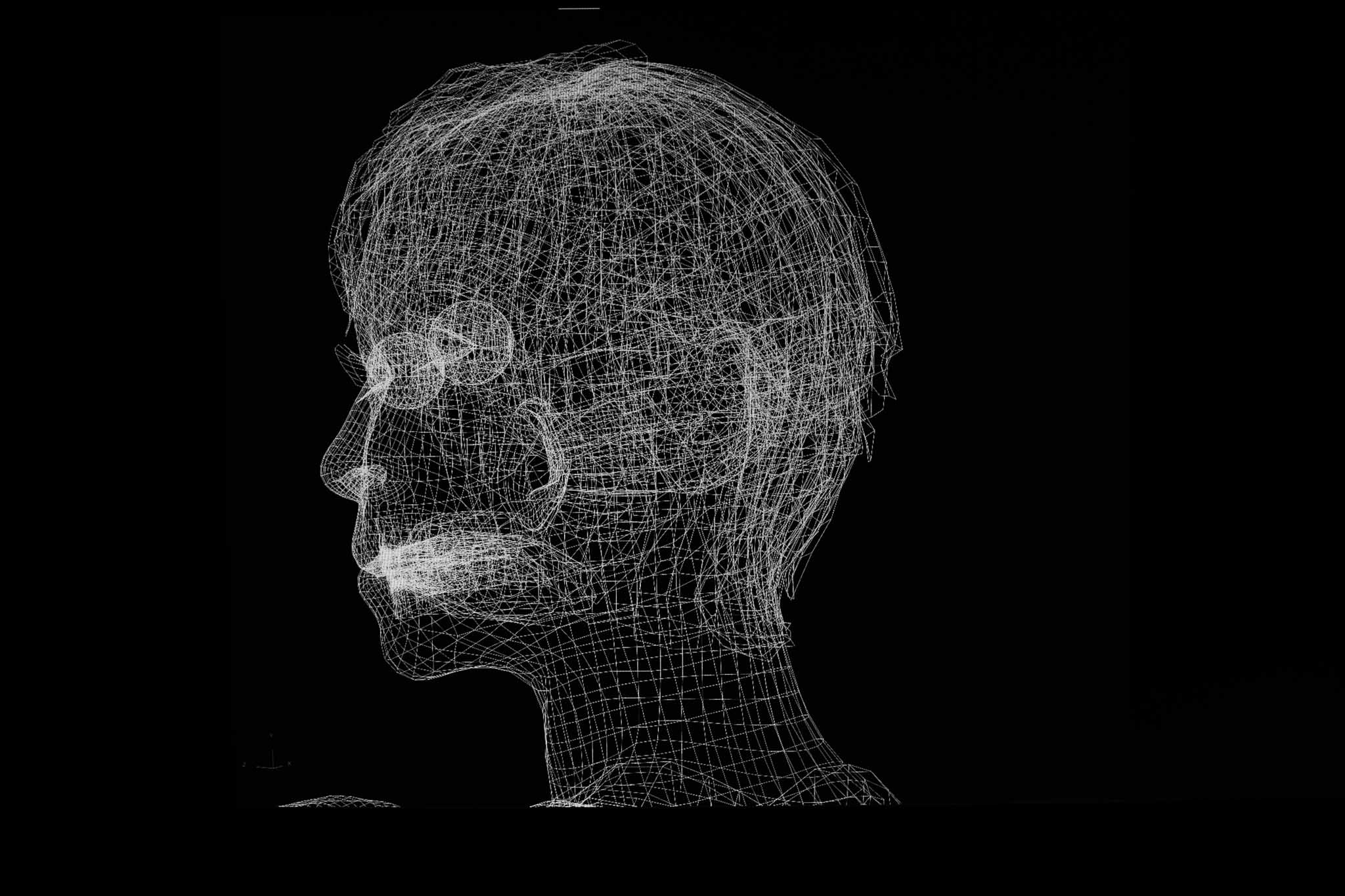
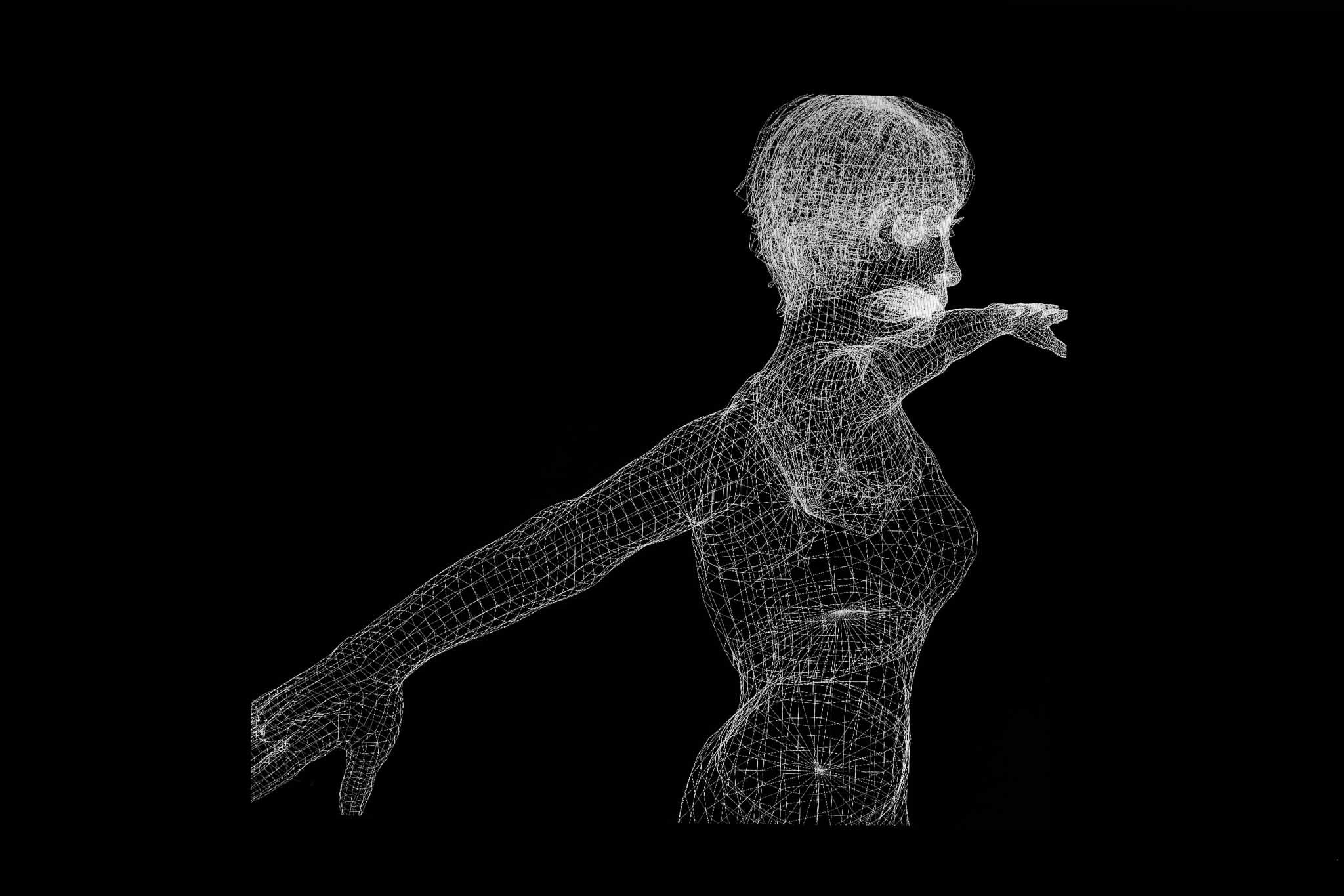
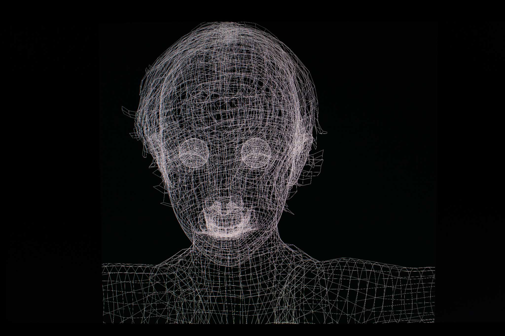
Personally I think the moving image element added a lot (and perhaps adds something to the table for assessment). It’s available on my blog as part of the process should an assessor want to see it. Again – being really honest with myself – I ask, does it add to the concept or detract? I think it detracts as it stands – it is not well-enough defined. This is a risk, I know, especially as in past assessments, I have been praised for my moving image work in particular. So it is scary to remove it from the list of items submitted. However, the point of the ePublication is that it combines moving and still imagery, both their techniques and conventions, in an object we once assumed would forever be still – the book. And so, by taking the film away for now, and focusing on that ePublication object alongside the printed book, I hope I make that concept extremely evident – more so than it otherwise might be.
I was not sure if the text was you or the AI or both and while I can see that is an interesting ambiguity I would also have found it interesting to know. Mmmm… I wonder if this is something that can be addressed in a slightly different more developed statement. Or if it’s good that the ambiguity leaves you a little lost… The blurred lines between I and Other, internal and external (and many other lines besides) are integral to the overall concept – see my CS essay: ‘Donna Haraway, another name who features in Barad’s work and others also influenced by agential realism, describes human beings as compost ”intertwined in a rich, dense matter in which boundaries between objects cannot be distinguished” (Haraway and Franklin, 2017:50 cited in Lupton, 2019:26). Such a concept is not easy for us to embrace. Enmeshment is a pejorative term in couples counselling, for example. It is distasteful, unhealthy and possesses something of Julia Kristeva’s Abjection’ (Field, 2020). From: https://sjflevel3.photo.blog/wp-content/uploads/2020/08/cs-a5-image-in-the-age-of-entanglement-sarah-jane-field-512666-offline.pdf
The music over the top did also add to the feel but playing it separately without the sync controlled by the artist (or her friend) felt a bit like I was watching your work while listening to something else – it kind of lost the connection? Good – this is a fortuitous Brechtian ‘alienation effect’ that came about through my struggles to get the music attached to the InDesign document as I wanted it. Although I know you lament the loss of connection, I think it is a useful interruption as the music feels tyrannically evocative (as film music and editing often are). However, there may be other ways to disrupt – and certainly, being forced to work within my technical limitations rather than choosing to is a never-ending issue!
I guess you may have to tie down what you are sending for assessment? (yes within two days!) While I personally like the idea of it exiting in multiple forms I think when it comes to the viewer (and maybe assessor) they prefer to be a bit more directed as to where to look? This seems to be the feedback I have had before when attempting something more fluid! I understand your concerns and of course, they hover in my mind too. As such, I think the decision to remove the film is the right one. But I also hope the assessor will take the central concept on board which is expressed in the following so well (and I may paste this onto the assessment page in response to your feedback):
“Despite my concerns about the photographic image, there are two contemporary concepts about images today which Daniel Rubinstein and Andy Fisher in their 2013 book, On the Verge of Photography: Imaging Beyond Representation express well; the first of which I use in the essay. They discuss the digital images’;
“…fractal-like ability … to be repeated, mutated through repetition and spread through various points of the network, all the time articulating its internal consistency on the one hand and the mutability and differentiation of each instance on the other” (Fisher and Rubinstein, 2013:10 cited in Field, 2020). From: https://sjflevel3.photo.blog/2020/08/28/bow-cs-end-of-module-reflection-part-1/
17/09/2020 – OCA alumni comment in response to questions I asked about the film element – the film (referring to older versions without Simon’s music) all the imagery is quite vintage whereas the publications are more of a mix (assemblage). This prompted me to include some contemporary imagery but am not sure it works as well. Have asked for comments – awaiting and will put here (each bullet point indicates a new person’s view:
- Completely off the cuff choice – Version 2. I quite like the ‘Fuse’ image and the stick soldiers. However overall my choice is just based on ‘like’ and not on any form of educated analysis, because I feel uneducated with regard to this work.
-
Just to muddy the waters, I think the second version is absolutely the stronger of the two. The second ties in better with the printed work; the first seems like a distant cousin of it (although works well as a standalone piece of art).
-
From a ruthless assessment point of view: your work is experimental and challenging in terms of both content and format (as in mixture of publication and video), and some assessors might struggle to engage with it in the time available. A thread of coherence/consistency between the publication and video might help bridge potential gaps in assessors’ interpretations.
-
To borrow an analogy I found when researching an essay: if ambiguous work is a question of ‘joining the dots’, in the first video the dots between it and the publication are a little too far apart – while the dots between the publication and the second video are spaced about right.
I think I’m more drawn to the first version. I like the vintage and not as keen on the contemporary.
I find the second version doesn’t give me so much eye ache and I can actually watch it whereas the first I had to close my eyes.
“Stronger”? Not sure, I have a personal preference for the second version with the more contemporary references in them though, does that make it stronger? My natural response was to try and form a narrative to the sequencing, which clearly doesn’t exist (not in any traditional sense at least), so this wasn’t the case when viewing the second edit. Is this why I preferred it? Possibly a factor, but I think it is more to do with the contemporary nature…
-
Music-wise, without knowing it was AI produced I don’t think it added much, but after finding out the fact it works much better for me. Backwards white-rabbit? Won’t that involve the devil or something?Not looked at the e-zine stuff, so I can’t offer any technical help there, sorry.
-
I’m sort of wondering why you think one might be ‘stronger’ than the other, and I suspect it is because you are so close to them. For me, neither is stronger, nor weaker. They both exist as separate entities, in their own space discussing (slightly) different things, albeit on similar plains.
Your choice will be an emotional one, and I really enjoy the Adam Curtis feel to them – that seeming disconsonance between ‘cuts’ held together by the soundtrack – which helps to provide this viewer with the notion, perhaps not in reality, of narrative. And perhaps that’s an interesting issue, some will search for a narrative, whilst others feel less of a compulsion.There is enough ambiguity to not “lead” the viewer in either version. So I wouldn’t worry about which might or might not attract another viewer (other than yourself) but release the one that you feel is right/most appropriate/etc etc.Either works.
- Not sure I agree that the first is ‘stronger’; but I would say that the second, for me, is more effective in the context within which you’re working. I could even handle more of the colour interventions. I think I said, when we talked about the ‘zine’ version, that a preponderance of vintage images makes me feel that the work is looking backwards at something. That might be your intention, but I’d would have expected, from your CS essay, that it’s focused at least as much on the ‘now’. I think this is the first time I’ve watched it with this music & whilst I like the music & it’s easier to listen too, the reversed ‘White Rabbit’ was a more effective ‘brain funk’!
- Yesterday, I was thinking, maybe the film is surplus to requirements and I need to get rid of it now. Perhaps it’s been a useful part of the process and led to some gifs, but I need to put it aside as it muddies the waters. I really need to focus on the publication and figuring out how I might get that to a physical state in the next couple of weeks in time to make a short video for assessment. (See next blog).
Non-film feedback
-
Regarding the publications – I’m not sure whether this is too late to comment (sorry if so) but I find the whole of the publication very strong and consistent, successfully building a creeping sense of eerie discombobulation…
… with the sole exception of the front and back cover images. They felt jarring to me when considered alongside the imagery inside.
But this might be your intention! I was prompted to redesign the cover by Ruth when she said something was missing. I agree with this comment that the covers are now still not quite right. I orginally deliberatley went for something quite stark, difficult to get hold of and hopefully a bit enigmatic. I have gone back and tried again…
-

Spread of outer covers so the right-hand side is the front and the left the back. It should be dark and deep blue, so returns to the very first cover page I designed but has evolved.

-
Some proofing suggestions:
-
The spacing before and after the / – not a big issue either way for me.
-
-
‘a dream’ don’t like it centralised because it looks out of place. either left or right justify
-
-
The text on the front cover – normal would be to read it from the other side. Maybe this is deliberate but I would prefer the other way round on the front cover. In the rest of the book the changes in orientation are OK. as is the faded text.
-
-
Couldn’t read the faded text (not meant to so have added that convention elsewhere to emphasise its presence)
-
Have added a space before the /


SJFIeld2020-")

SJFIeld2020-")
SJFIeld2020-")
SJFIeld2020-")
SJFIeld2020-")
