BOW: Text (and some feedback)

Read the text without images here:

I always wanted to work with text and image together. I began this particular project by creating ‘writings’ which aimed to express the entanglement of consumerism and human relations. Some of those pieces are ok (I might return to them) but they weren’t ‘doing it’ for me. Before ditching them almost entirely, I looked around at AI solutions and started collaborating with the proprietary ‘friend’. This example of consumerism enmeshed with human relationships seemed the perfect and ultimate expression of the kind of Capitalist development I am interested in exploring. (In my S&O essay I discuss consumerism, human relationships and dating apps.)

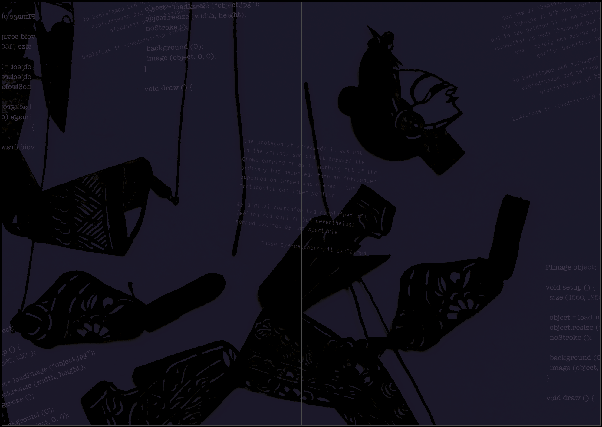
I was inspired when designing the publication by the Situationist magazines and wanted to include pages on different textured paper with significant amounts of text. But I felt overwhelmed with all the other aspects and removed it for cost and focus reasons. Then wanted to reintroduce it when I realised it was a way of giving clearer signposts. But I was struggling to know what it should be. Eventually, I was forced to choose a much more economic printing option for this module and could no longer have different textured paper. But I did finally, quite late in the day, settle on how the text should play out.

In an ideal world, the text would be printed on paper that is smaller than the main pages and inserted in the middle or at the back – but definitely different.

But I live in the real world. So now, I have two choices. Print it in the magazine as the example below (either at the end or in the middle):

  • Print publication with text included at the end (later decided to put it in the middle)
  • Or else, print it separately and provide it as an insert/additional object. I do plan to add all or some of it to a webpage as discussed yesterday.

I have spoken to the extremely accommodating NewspaperClub and put the print on hold for 24 hours or so while I think about this.

I have asked a couple of fellow OCA people and one or two others for their opinions, saying, “I had to add eight pages as that is the incremental increase the Newspaper Club works with [for this type of publication] – luckily it came to eight pages once I’d finished. Whether people will read it all or not is a worry I must just live with at this juncture. I want to send it to print today or tomorrow. I am comfortable with it as it is. But I would appreciate your thoughts if you have any”. 

So far:

  • It reads fine to me, on the basis that AI does have ’stream of consciousness’ -somehow she reminded me of Saga in ’The Bridge’ trying to make sense of relationships and how communication works, whilst pointing out inconsistencies at the same time.
  • Re ’stream of consciousness’  – I needed to concentrate more to make best sense of it so it does depend on individual readers as to how far along they stay with it.  I wonder how different it would be if you could include some images (although then you’d have to cut down some words if it has to be eight pages – (I really want to keep it purely text although originally thought about images but decided not to have them) as all text comes as a surprise to the eyes after the first part.  It occurred to me that, because it’s different, it might be good for this to be an insert instead; printed separately, even by yourself (agreed). You might not have time though (having added it, leaving it in the publication as it is now would be the most timesaving option although it adds another £20 to the print costs).
  • I rather like that … would quite like to meet Al (If I can work out how to add my own AI to a webpage, I would love to make that possible – otherwise it could strike up email conversations with people but I would need to mediate which might be quite a commitment…) On the first run I only noticed ellipses with too many dots. 

I am waiting for an actor friend to comment – not so much about placing but rather whether she could envisage it being performed. (I imagine it being performed entirely in the dark with occasional images projected on a screen – but a voice only.) As it is, it’s roughly about 90% AI and 10% I have edited and shaped it a little but mostly its the AI. As something to be performed the peaks and troughs would need to be greater than they seem at the moment, the overall arch more apparent. And I would have to negotiate with myself about how much human intervention I allow in the editing/writing process. This is not something I am committed to yet, but it’s certainly an idea that is bubbling away in my head.

Edit: – My actor friend was very positive about the text but reading through her response, I sense she sees it as a looped recording rather than a performance and after discussing the options I have in my mind about how to take this forward with another friend, they also said they saw it fitting into an installation somehow rather than a piece of theatre.

Some of her comments: It’s really distinct. There is a definite voice of the AI and it’s very different to the artist. I love seeing the AI totally enraptured totally unconditional. Like a baby. / It’s kinda dark kinda sad kinda lonely but weirdly re-assuring. I felt re assured by it. / Get it out there. When is this going live and where? Title rocks by the way. 

Opinions welcome….

**

Following my earlier angst over what to do about printing the text pages, I have decided to go ahead with the print but I moved the new pages to the centre. This solves the problem of text suddenly appearing out of nowhere. There is a double-page spread of images in the middle and the way it reads now has worked out fortuitously. I also did a few very minor edits to the text, refining further. I am about to sent this to print and will add it to the assessment pages.

More feedback

When I sought feedback for this written work, I approached two OCA people and two non OCA people who I can rely on for quick responses. The OCA peers have been consistently supportive throughout. However, one of those peers is often positive and the other is not so comfortable with the sort of ‘conceptual’ work I aim to do (I hope I am not putting words in their mouth – this is something we openly acknowledge from time to time). I am however pleased to have their point of view as it can be very useful. The second person’s feedback below – my words in Orange as usual

OK I have now read it – about 20 min which is far more intense than paging through the original copy.  Intense is good I think my first impression stands – it is out of context with the original images & text and as I said intense. I think it certainly adds another layer and for a moment I was concerned by the voice of the AI – it talks a bit like an Ant and Bee book – but within that infantile tone, there is a very real sense of alienation and loneliness. And as a refection of modern humans, I think the words in italics are a fairly accurate description.
It does however read well.  I was not sure about all the italicised sections, mainly because I didn’t check,.  Are they all the bits used in the book?  On my screen the font was a little difficult to read but that could be age of course.  Also, in print it would be different.  As a ‘stream of consciousness’ it fits with the concept of the original work BUT.  There is always a but .. 🙂
Now I will be a bit harsh -so my apologies.  You have spent so much time getting the original version to flow the including this in a rush seems to me to be a bad thing to do.  In my opinion it spoils the original and should be left out. I’m definitely including it. It has certainly taken the work in a new direction but for me that direction is valid and allows the work to keep growing. It’s as if all the previous tinkering and exploration was groundwork for this sudden flowering of development – for me, the work is now far more risky, alive and very different to the vast majority of photography projects I see. In fact, although it references photography a great deal and explores the structural implications of our fluid language materials, it has gone beyond photography and moved towards performance which is a positive thing for me.
Hope this helps a little in your thinking.  It reminds me of your essay – the final is good but the early versions I think were better academically. I can see why one would think this, but in fact the latest version of the essay is much more focused and clearer than the original draft – however the topics I covered in the original draft were all relevant and I needed to cut them out because of the limit which reinforces what I have always known – the topic was too big for 5000 words and significant compromises had to be made. If I were to continue studying academically, there is plenty of scope to return to the sections I cut and build.

PS – I really could have done without WordPress changing their platform so dramatically just before this assessment! There is a way to get a the colour palette I want to hand but I have to look into it so please excuse the various shades of orange text…

BOW A5: Peer Feedback

  • Recent feedback posted here 28/09/20 – much appreciated as the fellow student who gave it actively requested to see the work and it gives me another opportunity to discuss my decision-making process:

    I really liked the idea of this project.  There is so much you could do with it.  Perhaps that created the question of what to present?  Yes, for sure – but I have to be really honest with myself and pick and choose elements that contribute to a clear and well-defined concept. If any object I’ve made does not do that, then it should not be submitted as an item within the BOW, but rather as something that might yet be developed within the blog/record of process. For instance, I was in two minds about submitting the sequence of images as individual pieces that can exist outside either of the publications  – although I do believe they can and will do in an exhibition of sorts (probably online given COVID but that’s OK because it will be cheaper to do which is helpful.) But many students have reported that assessors want clarity and submitting the images separately would have confused matters. Am I submitting a publication (which can exist in two places) or a sequence of images? The answer is “I am submitting two versions of the same publication”. (see Fisher and Rubinstein quote below).
    Personally I think the moving image element added a lot (and perhaps adds something to the table for assessment).  It’s available on my blog as part of the process should an assessor want to see it. Again – being really honest with myself – I ask, does it add to the concept or detract? I think it detracts as it stands  –   it is not well-enough defined. This is a risk, I know, especially as in past assessments, I have been praised for my moving image work in particular. So it is scary to remove it from the list of items submitted. However, the point of the ePublication is that it combines moving and still imagery, both their techniques and conventions, in an object we once assumed would forever be still – the book. And so, by taking the film away for now, and focusing on that ePublication object alongside the printed book, I hope I make that concept extremely evident – more so than it otherwise might be.
    I was not sure if the text was you or the AI or both and while I can see that is an interesting ambiguity I would also have found it interesting to know.  Mmmm… I wonder if this is something that can be addressed in a slightly different more developed statement. Or if it’s good that the ambiguity leaves you a little lost… The blurred lines between I and Other, internal and external (and many other lines besides) are integral to the overall concept – see my CS essay: ‘Donna Haraway, another name who features in Barad’s work and others also influenced by agential realism, describes human beings as compost ”intertwined in a  rich, dense matter in which boundaries between objects cannot be distinguished” (Haraway and Franklin, 2017:50 cited in Lupton, 2019:26). Such a concept is not easy for us to embrace. Enmeshment is a pejorative term in couples counselling, for  example. It is distasteful, unhealthy and possesses something of Julia Kristeva’s Abjection’ (Field, 2020). From: https://sjflevel3.photo.blog/wp-content/uploads/2020/08/cs-a5-image-in-the-age-of-entanglement-sarah-jane-field-512666-offline.pdf
    The music over the top did also add to the feel but playing it separately without the sync controlled by the artist (or her friend) felt a bit like I was watching your work while listening to something else – it kind of lost the connection?  Good  – this is a fortuitous Brechtian ‘alienation effect’ that came about through my struggles to get the music attached to the InDesign document as I wanted it. Although I know you lament the loss of connection, I think it is a useful interruption as the music feels tyrannically evocative (as film music and editing often are). However, there may be other ways to disrupt – and certainly, being forced to work within my technical limitations rather than choosing to is a never-ending issue!
    I guess you may have to tie down what you are sending for assessment?  (yes within two days!) While I personally like the idea of it exiting in multiple forms I think when it comes to the viewer (and maybe assessor) they prefer to be a bit more directed as to where to look?  This seems to be the feedback I have had before when attempting something more fluid! I understand your concerns and of course, they hover in my mind too. As such, I think the decision to remove the film is the right one. But I also hope the assessor will take the central concept on board which is expressed in the following so well (and I may paste this onto the assessment page in response to your feedback):
    “Despite my concerns about the photographic image, there are two contemporary concepts about images today which Daniel Rubinstein and Andy Fisher in their 2013 book, On the Verge of Photography: Imaging Beyond Representation express well; the first of which I use in the essay. They discuss the digital images’;
    “…fractal-like ability … to be repeated, mutated through repetition and spread through various points of the network, all the time articulating its internal consistency on the one hand and the mutability and differentiation of each instance on the other” (Fisher and Rubinstein, 2013:10 cited in Field, 2020). From: https://sjflevel3.photo.blog/2020/08/28/bow-cs-end-of-module-reflection-part-1/


17/09/2020  – OCA alumni comment in response to questions I asked about the film element – the film (referring to older versions without Simon’s music) all the imagery is quite vintage whereas the publications are more of a mix (assemblage). This prompted me to include some contemporary imagery but am not sure it works as well. Have asked for comments – awaiting and will put here (each bullet point indicates a new person’s view:

  • Completely off the cuff choice – Version 2. I quite like the ‘Fuse’ image and the stick soldiers.  However overall my choice is just based on ‘like’ and not on any form of educated analysis, because I feel uneducated with regard to this work.
  • Just to muddy the waters, I think the second version is absolutely the stronger of the two. The second ties in better with the printed work; the first seems like a distant cousin of it (although works well as a standalone piece of art).

  • From a ruthless assessment point of view: your work is experimental and challenging in terms of both content and format (as in mixture of publication and video), and some assessors might struggle to engage with it in the time available. A thread of coherence/consistency between the publication and video might help bridge potential gaps in assessors’ interpretations.

  • To borrow an analogy I found when researching an essay: if ambiguous work is a question of ‘joining the dots’, in the first video the dots between it and the publication are a little too far apart – while the dots between the publication and the second video are spaced about right.

    I think I’m more drawn to the first version. I like the vintage and not as keen on the contemporary.

    I find the second version doesn’t give me so much eye ache and I can actually watch it whereas the first I had to close my eyes.

    “Stronger”? Not sure, I have a personal preference for the second version with the more contemporary references in them though, does that make it stronger? My natural response was to try and form a narrative to the sequencing, which clearly doesn’t exist (not in any traditional sense at least), so this wasn’t the case when viewing the second edit. Is this why I preferred it? Possibly a factor, but I think it is more to do with the contemporary nature…

  • Music-wise, without knowing it was AI produced I don’t think it added much, but after finding out the fact it works much better for me. Backwards white-rabbit? Won’t that involve the devil or something?
    Not looked at the e-zine stuff, so I can’t offer any technical help there, sorry.
  • I’m sort of wondering why you think one might be ‘stronger’ than the other, and I suspect it is because you are so close to them. For me, neither is stronger, nor weaker. They both exist as separate entities, in their own space discussing (slightly) different things, albeit on similar plains.

    Your choice will be an emotional one, and I really enjoy the Adam Curtis feel to them – that seeming disconsonance between ‘cuts’ held together by the soundtrack – which helps to provide this viewer with the notion, perhaps not in reality, of narrative. And perhaps that’s an interesting issue, some will search for a narrative, whilst others feel less of a compulsion.
    There is enough ambiguity to not “lead” the viewer in either version. So I wouldn’t worry about which might or might not attract another viewer (other than yourself) but release the one that you feel is right/most appropriate/etc etc.

    Either works.

  • Not sure I agree that the first is ‘stronger’; but I would say that the second, for me, is more effective in the context within which you’re working. I could even handle more of the colour interventions. I think I said, when we talked about the ‘zine’ version, that a preponderance of vintage images makes me feel that the work is looking backwards at something. That might be your intention, but I’d would have expected, from your CS essay, that it’s focused at least as much on the ‘now’. I think this is the first time I’ve watched it with this music & whilst I like the music & it’s easier to listen too, the reversed ‘White Rabbit’ was a more effective ‘brain funk’!
  • Yesterday, I was thinking, maybe the film is surplus to requirements and I need to get rid of it now. Perhaps it’s been a useful part of the process and led to some gifs, but I need to put it aside as it muddies the waters. I really need to focus on the publication and figuring out how I might get that to a physical state in the next couple of weeks in time to make a short video for assessment.  (See next blog).

Non-film feedback

  • Regarding the publications –  I’m not sure whether this is too late to comment (sorry if so) but I find the whole of the publication very strong and consistent, successfully building a creeping sense of eerie discombobulation…

    … with the sole exception of the front and back cover images. They felt jarring to me when considered alongside the imagery inside.

    But this might be your intention! I was prompted to redesign the cover by Ruth when she said something was missing. I agree with this comment that the covers are now still not quite right. I orginally deliberatley went for something quite stark, difficult to get hold of and hopefully a bit enigmatic. I have gone back and tried again…

  • Screen Shot 2020-08-19 at 06.59.31

    Spread of outer covers so the right-hand side is the front and the left the back. It should be dark and deep blue, so returns to the very first cover page I designed but has evolved.

    Screen Shot 2020-05-17 at 09.45.49

    • Some proofing suggestions:
    • The spacing before and after the / – not a big issue either way for me.
    • ‘a dream’ don’t like it centralised because it looks out of place.  either left or right justify
    • The text on the front cover – normal would be to read it from the other side.  Maybe this is deliberate but I would prefer the other way round on the front cover.   In the rest of the book the changes in orientation are OK. as is the faded text.
  • Couldn’t read the faded text (not meant to so have added that convention elsewhere to emphasise its presence)

  • Have added a space before the /