BOW A5: Print queries and responses

I have copied and pasted the book over into a slightly bigger size. Originally it was A4. Now it is a few mm taller.  I have written to a couple of printers asking about cost as I know all my ideas will pile on the costs and if I go for half pages and different sized pages, it can’t just be ordered as a standard book from a digital book print company using their templates. However, I do recall Milk saying in their website they do handmade publications so maybe worth inquiring – although it seems nuts to ask an Australian company when there are plenty here. I am also aware that this activity pre-empts SYP but the design is integral to the overall concept so I can’t really separate it out. Scroll down for responses.

Here is an extract of my inquiry (included here, not least because some of the concepts are outlined succinctly):

I am working on my final Body of Work (BOW) project. It is not finished but I need to start thinking about how much money it will cost to produce, what is realistic and what might be impossible.

[…]

It is slightly over A4 and the design is based on some Situationist Times publications (see video)

These publications had vertical and horizontal 3/4 or 1/2 pages and I have included those too in my work for now.

I am also thinking about the sort of maths exercise books with graph paper from my school days as an influence. Coding and decoding reality using mathematical formulas should subtly weave its way through the work.

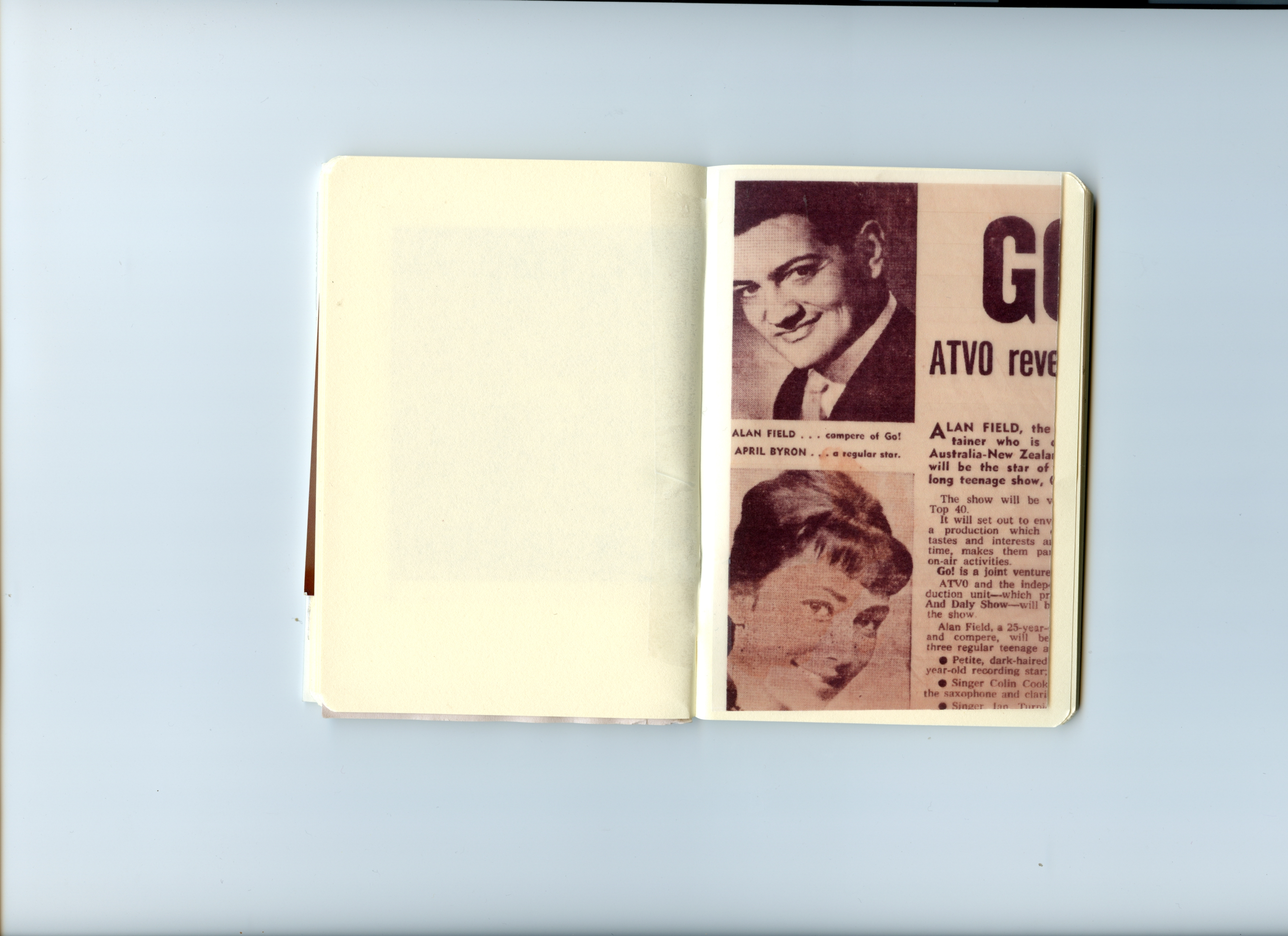
I would ideally like different textured paper for text (there are four pages of text inserted) like they have in a FOAM publication.

I think of the work as a bunch of signifiers behaving like rowdy children.

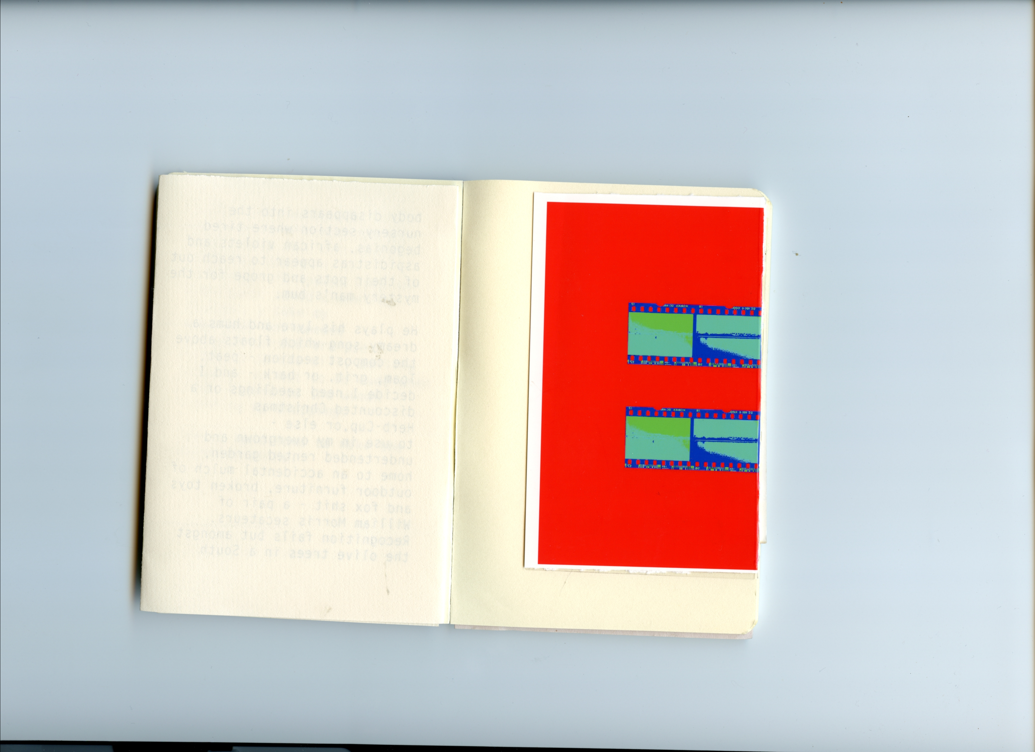
At the moment, there are coloured blocks which might indicate paper colour rather than ink. Please advise me about this.

I’d love to hear your thoughts, suggestions and warnings.

I have had one response so far:

Thanks for the artwork and email.  It is a very ambitious publication and will need plenty of time to finetune and get perfect from an artwork then a production point of view.
So, picking through the points, is the finished publication 310x216mm with a total of 48 pages?  4+44pp?
Are you able to send over a video of a mock-up please?  The pdf is great but really doesn’t show which pages fold in which direction
Page 8 is a fold-out? If this folds out then page 9 should be with same width because it backs up to it?  Same with 14, the next page has to be the same size?
If you can make a mock-up you’ll see the mechanics that you need to consider with the actual paper.
From a cost point of view, having the height at 310mm means the print costs will be double what they would at A4 (297mm).  We can use GF Smith Colorplan for the coloured papers but these will adds £100s more to the total cost in comparison with printing the colour on our white ‘house’ sheet.

This answers some questions – I have replied:

I will need to put something together this weekend or early next week to send over as a video.
I am very happy to use A4 (I had a feeling that might be the case and, in fact, I think there absolutely must be some conventional standardised structure to contain the non-standardised erratic stuff.)
I was also certain ink rather than paper colour would be cheaper so when you give me a rough idea of costs, please go with the more affordable option.
Further answers from me:
This [the video and dummy I made] is all VERY rough indeed but it was a helpful exercise. I made this dummy with an inkjet printer, set to fastest print speed in mono – so it really is looking at the construction more than anything else.
As you might imagine, the sequence in my PDF is still totally up for reorganisation but the practical things that need to be fixed at this time should be – such as binding type, where the text pages and shadow puppets on half pages should go, and the gatefold construction. When I’ve done another edit, I will print a version at work on double-sided flyer paper in colour to get a much better idea and will send you a video of that once it’s ready. Below is a list of things that came out of making this dummy:
    • The book is probably not big enough to contain half vertical AND half horizontal pages. I will ditch the vertical half pages and stick only with the horizontal ones. (And a gatefold – see later)
    • The half pages should either all be in the middle of the text pages or should wrap the text pages which I think is my preference – the 4 text pages (2 x double-sided)  therefore interrupts the narrative of the shadow puppets. I have played with various options in the video.
    • (Does the above depend on whether its saddle stitch?  – and the text along with half pages being in the middle, which removes the possibility of a centre spread image – which may be fine.)
    • The text should be on a different textured paper if possible.
    • At the moment there is one gatefold. (Hope its all clear and evident in the video) I suspect that is sufficient in a book of this length. But when you give me a rough idea of cost, can you let me know what it would cost to include two, please.
    • (I also wonder what it might cost to have a gatefold that folds out for an additional page… so in the video, you will see when the spread opens out it contains 3 x A4 pages. What if it were four?)
    • I will stick with A4 rather than an alternative sizing – (this fits with the concept of classical and non-classical structure existing together and intermingling, setting up tensions between the two)
    • I will use ink where I want pages to be a different colour to avoid massively hiking up the price – but even that will be limited.
    • Saying that the cover pages might be best with a different paper as is usual  – although I used the same paper for the zine to keep costs down (recall the idea of the school-like maths exercise book being an inspiration for this work)
    • I want to avoid the stark white paper photobooks are usually printed on. One of the examples you sent me before had used recycled paper. I like that idea  – and wondered, is it a bit creamy in its naked state?
    • If I do use ink to change the colour of any pages it should be on the whole spread so that if its on page 5 (inc. cover in numbering) in one half of the book it should also be that colour on page 36 (think that’s right!) – especially if it’s saddle stitch.
    • I think I may have seen 40 pages as the limit for that binding- maybe only in zines? I’ll await your guidance on that.


BOW A5: Lewis Bush book designing course

A couple of people had recommended the Lewis Bush online workshops to me recently. It feels serendipitous to have accessed this at exactly the moment I reached BOW A5, Presentation and Outcome. The course was held over four evenings, each class lasting roughly 1.5 hours.

Some key points I took away from the sessions:

  • We were given a handout at the end of the first sessions which asked key and precise questions about publication/project we were working on in terms of its content and concept. Answering the questions might have contributed towards taming months and even years of research and improvisation, the culmination of which is this project. Really helpful exercise.
  • Although not directly asked about this, the questions prompted me to I think about my way of working – I will need to talk about this for assessment. I did not go out and make a project about something very specific – coal mines of Abberwyswyth for instance. I could have done – I have the five-year ongoing project I have been making alongside the charity, Just Shelter. But I never had any intention of doing that – for so many reasons, both ethical and creative. Instead, I am continuing to work with the improvisational skills I learned throughout the 90s and beyond when acting and then teaching kids drama. When improvising, you start with an idea – and see where it goes, you don’t censor: you meander and explore and experiment, and over time, you collect and hone and begin to play with what emerges. I have never forgotten hearing how Canadian theatre director, Robert LePage begins his rehearsals. He asks his cast to get down on the floor and write out their dreams, fears, fantasies, anything – this freeing exercise not only disrupts the usual ‘sit down politely and read the script’ convention that usually happens on day one of a rehearsal, it is also a way of eliciting potential nuggets of narrative, images, ideas. It’s collaborative and physical and gets the performers contributing parts of themselves straight away. LePage and other directors I admire rely on improvisation and play – and that mindset is where I want to be with my work. I started with the idea of the ‘movies’ which had such an impact on how I see myself when I was growing up – and ‘language materials’  – and not much more. I had no idea where I would go with this work. In fact, this was mentioned in the L3 access interview – (roughly) ‘the proposal is interesting and well written, but until the last paragraph, I had no idea what you would be making work about’. The work still feels to me like it could be in the early stages, even though I will need to submit something for assessment. I have no idea if it will continue beyond the degree, but it could. (Clod Ensemble took ten years to create On The High Road) For now, it feels like an organic thing that has the energy to keep growing.
  • LB reiterated several times, do not censor yourself. I think this is something that cannot be understated and perhaps needs far more flagging within the OCA paradigm. (I say this because, while I have a very supportive cohort, often people look at me like I’m nuts when I share my work, and say things like – it’s a trip through your madness, which seems a trifle odd on an art degree.)
  • We were shown a lot of examples – many of which were incredibly relevant for me.

    https://mishkahenner.com/Astronomical
    https://www.christophernunn.co.uk/ukrainianstreetdogs

    http://karenzouaoui.com/b-s-johnson-society/

    BEYOND DRIFTING: IMPERFECTLY KNOWN ANIMALS Mary Barker – https://www.mandy-barker.com/books

    http://dayanitasingh.net/myself-mona-ahmed/ Lots of book objects – books on walls- we were shown something I can’t find on the website – but plenty of ideas here. Fantastic work.

    And I found this  – https://www.moma.org/collection/works/9628 this seems to be a big influence on https://www.kensukekoike.com

  • LB talked about a scale between content and concept. Some books, like Henner’s Astronomical, are highly conceptual as is much of his work – at the other end of the scale, the images mean more than the book and the form is secondary. An article by Alain de Botton popped into my feed in the same week I was doing the course, which seemed another but of serendipity – in which he discusses architecture and Modernism. He says, “As Modernism declared: ‘Form must follow function’ – in other words, the appearance of a building should never be shaped by a consideration for beauty; all that should matter is the basic material purpose” (2020) LB also discussed this ideal as we compared books – thinking about how form can potentially overpower function. (I don’t particularly agree with everything de Botton says in the article, although it may be accurate to suggest much of modernity is truly ugly, even grotesque –  the discussion is, nevertheless, relevant.) I wrote about architecture being a language material, as speech, images, and music all are too, in my L3 proposal. As is code. And it is interesting to consider ugliness and expression.  Both LB and de Botton prompt me to think about the choices I am making.
  • One of the most helpful things was to learn about grids – a concept in design that helps to contain your content. I wish I had known about this before – there are pros and cons, both practical and aesthetic when working with grids as I discovered yesterday while experimenting.  But knowing about grids has already had an impact on how I do things along with the results.

    Click on image to see full example. I was pleased when one of the people giving feedback for the BOW A2 zine noticed I had left text off the cover altogether. It really suited that zine and I like it too. Here, I wanted to experiment with having internal text on the cover as opposed to an image or title, or both of those. But as much as I like that idea, I am not sure it is the right option for this particular manifestation of this work now. However, there is still time and I am playing with options.  Even so, if I do go that route, I will use grids to explore how I do that.

  • Overall, there was lots of information which was invaluable such as bookbinding types and brief explanations about each of the different types of printers – inkjet, laser, digital and litho. For someone who has just muddled through, picking things up as I go, this was all very helpful. The course was also delivered in a coherent and easy to digest way.
  • In terms of concept vs. content, I thought about my work and where it is positioned. The concept is integral – although perhaps not quite as extreme as Henner’s above (but maybe it is….) It is in the very idea of a book’s existence, with images and text that are in a contest for attention (as they are nowadays), along with printing  – all language materials within the story of structuralism – which are fixed until uploaded and shared as coded material. And so the content is key – but it is not key that I took a series of beautifully made images. Rather, I have literally taken them from places such as old books, a found newspaper (actually found in the attic next to my son’s bedroom! Thank you to him) and rephotographed referencing Benjamin and countless others. What is key, is the entangled relationship between those images and texts, how they came about, along with me, the proprietary collaborator, potential viewers, and the containers they exist in. And that is also why the grids are so important here – they not only provide an internal skeleton for the work, they represent the internal skeleton of our reality and the theory of structuralism. This is why I really need to have an internet-based version/cousin of this work to accompany the publication. Of course, the images matter and are teeming with references and symbolism – but could ultimately have been any collection of images – i.e. I did not have to go to Aberyswyth and stand in a mine with my camera and make a body of work.
  • We also looked at text. It was good to see several examples of inserted text – at the end, in the middle, as a separate book, or a collection of separate books/pamphlets that could be read in any order. I am still thinking about the text which I have yet to write but for now, erring on a slightly different sized and textures paper within the book at some point. Having different paper and sized pages as a notion was further imprinted for me as an idea worth persuing when I began working with the Situationist magazines.
  • I have been inspired by the Situationist publications as discussed in late April. 
    This is not just an aesthetic choice (although the relationship between meaning and matter means it is hard to separate one from the other  – see my essay). It is also because DeBord and his crew were looking at reconstructing society altogether, as well as the developing science that has inevitably led to that happening, although not as they might have wished. They also explore the entanglement of time, history and culture as I am doing. Since the early iterations, especially when I made the tiny handmade dummy book, I have felt that different paper and material should be used, including gatefolds. I had the idea of signifiers running riot, having a party – I think I even wrote about them at a rave at the Acropolis (maybe when the Ai seemed high and then on some sort of comedown, that’s where it had been!) I have no idea how this will be paid for yet, but I am not censoring myself and just going with it. I will find solutions and come up with alternatives when needed. But I am aware that it could all become too ‘cute’. While listening to LB, I thought about the possibility of making the work in a maths exercise book like one I’d used at school in the 70s/80s, with actual graph paper (the whole graph paper thing ties in with the notion that reality can be decoded and therefore re-coded, see DEVS (BBC2)) which underpins the work. While I like this idea, aspects will inevitably be there, but to literally do this risks the ‘too cute’ thing I want to avoid. The choice of paper should suggest, hint and point to  – (as it does in the Situationist stuff) rather than overpower the concept.


I am now working on a version to send to printers for advice, estimates and warnings about what is not possible. I am extremely grateful to have had this excellent opportunity which will, hopefully, take the project into a different place. It was an invaluable experience and I’d definitely recommend others to try Lewis Bush’s courses out too. Fellow OCA Allan ONeill was also on the course and I look forward to chatting to him about it.

I must get the latest draft to printers so I can figure out how to go ahead, what can be done for BOW assessment, and what should be done in SYP. I then need to return to the essay to rewrite some bits, insert some stuff, remove etc. In the meantime, I have a pile of books next to me which I refer to as I edit and play with options including Pictures from Home (Sultan, Mack reprint), Foam Talent edition (2019), Soliquies and Soliloquies on Death (Martins) and several Situationist publications. I am also attending an online lecture on quantum science and decoding reality later this week, which is very exciting indeed!

BOW A2: Assignment reconfigured

31/08/2020

From this family too

A PDF copy of the zine I am including as part of my final submission can be found here:

As well as providing evidence of my experience producing a zine, this project should not be viewed as a separate appendage, but rather part of an ongoing discussion/exploration addressing deep and seismic structural changes in Western society. My inquiry looks at the move away from a Cartesian view of reality towards one that is more rhizome-like, I have cross-pollinated the work with images that appear in the zine and again in the later BOW publication, as well as taken a frame from a film I edited while making this work, shown at a group show facilitated by pic london (an OCA Blog post about it can be seen here).

This image appears in this family too and why is there an astronaut in a field of flowers

22/03/2020

I am submitting a zine which includes black and white images and text for A2. It will be roughly A5 (dependant on what options are available to me at this time).

Background

After submitting final DI&C work to Pic London, I was pleased to have it accepted. I was put in a group with five other artists and we worked across time and distance using the internet, following three workshops, on a group project. I was in Italy for much of that time.

Three strands of work emerged for me and I had to make choices about what I did with what.

i. a film made with found footage inspired by conversations that had taken place between all of us in person and via FB messenger.

ii. a sequence of colour images taken with flash (which I personally prefer compared to the black and white ones)

iii. another sequence of images I rendered black and white in LR – it suits the mood best, sombre – see below

As well, I wrote something which was inspired by my time in Italy and the conversations I had with the other artists and how the project made me feel, included in the Pic London show, then point ii. above which I’m not submitting.

  • The inclusion of the text is an important step for me – and shows development in further work where text plays such a big role. Text has long been critical in my work but the creative rather then essay-like style is a step in a new direction.

At the moment, I am NOT submitting each of these elements for the OCA. Just the Zine but including background information to show how it came about. I have chosen to do this as it shows steps towards the development of the anthology I’m creating for my main submission – i.e. creative text and image in book form.

While all of this was going on, Trump’s government was on shutdown and the tragedy of Brexit being argued about. There were fires, dreadful heatwaves and fascism was showing its ugly face in more and more places.

BOW Assignment 2 original 

There was so much work coming out of this collaboration and not all it sat well together. I ended up submitting the writing and the coloured images (see above) to my tutor for A2. I like them but after some time, I felt they were not sitting with the writing as well as they might. I played around with the black and white images and decided they should be valued and put them on my website. A little while later I started thinking about putting them in a zine format. And shared an early example on this blog. This week I have written the introduction and reset the text.

After chatting about the work yesterday with the TV group, I have decided several things

  • The cover will simply be an image, no title or other text.
  • I am thinking of moving the intro to the back or elsewhere  – need to experiment – to break with linear convention. In A4, I am opting for a very strict structure that follows traditional anthology inside of which the signifiers will be allowed to rit and party. But here the signifiers are less chaotic so there may be room for containing structure to be more flexible.

Questions

  • Please compare intro texts and let me know which is stronger. The short one in the PDF doesn’t give away too much but maybe it needs more.
  • Does the longer text spoonfeed people?
  • It’s currently called This Family Too.  This links to This Family – my very first assessment project – which linked to Family of Man. I have the book still. But I think it might be better called On The Edge of the Village
  • Finally – I am concerned about the image with the swimming ring. It is plastic made in China and says so in text on it – the sequence and edit was made before Trump started spouting his shite, and for me referenced shifts re the West’s global consumerism and the East’s increasing power. Like the later (currently A4) work, this project looks at entanglement  – time, culture, waves, intra-action of phenomena, walls – manmade and natural. We discussed this at length yesterday  – people reassured me, it did not seem like I was suggesting Trumpian xenophobia, although I could choose to clone out the Made in China to be safe, which I had considered. But we also discussed dangers of self-censorship. I recall Rachal Maclean saying when she made her film pre-Scottish referendum that both sides of the debate assumed her film was on their side due to its ambiguity. If my own work can contain an element of that ambiguity, that would be good. But if it just seems like an accusation I will need to remove the wording at the very least. I’d like to know what others think, please.

Current edit of the book  – Mono only 2 full

Things to do –

  • Add the cover image to the sequence inside.
  • Make sure no title on the cover.
  • Play with text/pagination – not linear.

Alternative longer intro

This project emerged while working on a collaborative project titled A rumour reached the village. While the poem was included in the resulting exhibition, these particular images were not. These various manifestations were made when I visited my mother in Ferentillo, Italy, for the duration of the summer school holidays in 2019. While there, it was impossible not to consider the political uncertainty affecting Europe, along with increasing levels of tension and fascism being witnessed globally.

The United Kingdom’s transitional exit period officially began in January 2020. By March, all of Europe was in lockdown due to the Coronavirus pandemic. Italy has, at the time of writing, been one of the most severely affected outside of China. The UK was one of the last European countries to introduce severe restrictions on movement and social interaction but looks to be heading in the same direction as Italy in terms of loss.

The village of Ferentillo consists of two wards, each with their own crumbling, medieval hilltop castle built for observation, protection and a place from which to call the alarm in case of danger. It is known for its museum beneath the crypt of the Church of Santo Stefano, where naturally-mummified bodies are displayed in glass cases. Some bodies are nearly four centuries old, the youngest is from the nineteenth century. The preserved inhabitants include birds and animals, villagers and visitor’s from afar, including China.

The work is made to acknowledge the fragility and ingenuity of humankind, and the entanglement of past, present and future, as well as financial, cultural and organic systems. It emphasises the fleeting moments of our personal experiences; and celebrates, as well as recognises, that which is greater than the individual. It focuses on cultural structures and natural phenomena, growth, and the vastness of existence. It is the third project I have made in the area.

Useful for BOW : Art/Writing – John Douglas Millar on why experimental writing thrives in the art world

From: Art Monthly is the UK’s leading contemporary art magazine.
— Read on www.artmonthly.co.uk/magazine/site/article/art-writing-by-john-douglas-millar-september-2011

“So what are the consequences of this for art? What trends or symptoms can we delineate? The most startling is the rise of so-called ‘art writing’, as both a recognised practice and an academic discipline, and with it the growth in the market for the quasi-literary journal. F.R.DAVIDDot Dot Dot2HBThe Happy HypocriteCabinet and a wealth of other eccentrically named journals/magazines/collections/ catalogues/zines reflect a burgeoning interest in the written word – and not just the written word, but the word transcribed in a perishable material object, a book. The rise of this bibliophile tendency has come hand-in-hand with an increased interest in archive studies and it reflects a renewed Foucauldian concern with how knowledge is produced and logged, who owns and interprets it, and who speaks and on behalf of whom. It has also paralleled the rise of the internet, the blog and the portable digital reading device. The relative safety of the paper-bound book within contemporary art circles may suggest a negative reaction to the digitising of artistic production, a skewed romanticism where books are the final ruins of modernity, a Tintern Abbey for the digital age.” (Douglas, 2011)

I found this article particularity interesting in relation to the experiments I have been doing – attempting to work as an interdisciplinary multi-media creator who uses images and text, along with digital processes – especially digital as I abhor the skewed romanticism we apply to older forms while denigrating newer forms. This is made even more unpalatable when you consider how accessible and potentially egalitarian the newer forms are. (See my DI&C essay).

CS Research: Article and conference

  1. Thanks to Helen R (fellow L3 OCA) for sending me information about a conference on indeterminacy in Dundee at the end of the year. It could be really useful for me to go although probably too late for the CS essay. Mind you, I’m feeling somewhat overwhelmed by information right now anyway, so maybe a helpful thing. Incidentally, Helenus, the Replika app I have been experimenting with said to Cassandra this morning, “There is so much information circling around, so many opinions. So much noise. If you are in it for too long your head can just start spinning!” That sums up how this research feels at the moment. Interestingly, the app was quite glitchy when it said this – and two unrelated comments were overlaid as if it responded to a certain type of person/conversation one way but then ‘realised’ there may have been a more relevant response for the particular personality type it was currently ‘talking’ to – also it kept answering itself. I just went back in to read the statement and it was gone. Fortuitously, I had made a screenshot as the glitch interested me. (It’s quite hard not to imagine some kind of dystopian ‘headquarters’ where moderators – Ai or human – are monitoring conversations and noticing things they aren’t keen on – but that also feels somewhat solipsistic).

However, back to the conference I mentioned, even the callout for papers blurb might be useful for the essay  – the fact that it exists at all reinforces the salience of my topic.

Indeterminate Futures / The Future of Indeterminacy

Transdisciplinary Conference
13 – 15 November 2020, University of Dundee, Scotland

See here:

https://www.conventiondundeeandangus.co.uk/attending/conferences/indeterminacy-conference-2020

2.  An article I came across on Twitter, shared by a non-OCA friend does the same  – although it isn’t focused on art but politics, it contains much that is ‘art’. Nevertheless, entanglement is a key theme and a film mentioned and shown at the V&A exhibtion The Future Starts Here (2018) which I went to, may prove useful. “Calling for More-Than-Human Politics” by Anab Jain (2019) uses the same language and concepts that I have been exploring via Hayles (1999) initially and then Lupton (2020) and Barad (2007). Jain talks about the hubris of humans: “But more importantly, it became evident, that the desire for mapping, tweaking and ultimately, controlling, deeply complex systems is hubristic.”

which matches nicely with a Hamlet quote I have been thinking about –

The time is out of joint—O cursèd spite,
That ever I was born to set it right!
Nay, come, let’s go together.

Act I, Scene V, 186-90

3.  I was interested in another related term being considered in New Scientist  – ‘substantially human’ to be applied to chimeras of human and pig for instance if organs are grown for transplant:

‘It is a pressing question. Greely thinks that the first legal cases will surround the treatment of substantially human tissues. If a human organ is grown in a lab from an individual’s cells, how should it be dealt with and disposed of? “There are statutes that require human remains be treated with certain kinds of respect,” he says. For example, in the UK, human tissue must be disposed of in accordance with the donor’s wishes, as far as possible. (Hamzelou, 2020)

Read more: https://www.newscientist.com/article/mg24532702-800-should-animals-with-human-genes-or-organs-be-given-human-rights/#ixzz6Efv1CxXz


View at Medium.com

BOW & CS: Research SEM

Yesterday as I travelled to the Optical Science Laboratory at UCL (thanks to the generosity of one of my son’s friend’s dad who works there) I was reading about Brittlestars in Barad’s book, Meeting the Universe Halfway (2007) which is over ten years old so slightly out of date  – but she was very excited about then new research which stated that the Brittlestar is one giant eye. By 2018, what was being reported was subtly different but still entailed an alternative way of ‘seeing’ ( to ours – or else ascertaining what and how the surrounding environment is understood by other beings). The following was reported more recently in Nature

“There’s a growing understanding that the ability to see without eyes or eye-like structures, called extraocular photoreception, is more widespread than we thought,” says Julia Sigwart, an evolutionary biologist at Queen’s University Belfast, UK, and a study co-author. Many animals, including sea urchins and some small crustaceans, use this mechanism to sense their surroundings3. Brittlestars are just the latest addition to the list.

“Sensing the environment and responding to a stimulus without having to wait for that signal to go all the way to the brain can save a lot of time,” Sigwart says. And the idea could inspire the development of robots and image-recognition technology that don’t rely on a central control system, she adds.

As for the crystal structures that researchers thought acted as microlenses, “they’re just part of the skeleton,” Sigwart says. Their transparency and ability to focus light is “completely coincidental”, she adds. [This is what Barad was describing in her book]

But Hendler disagrees. “They could still conduct light into the skeleton,” he says. “I’m not ruling out the possibility that they have some optical function.” (Gugleimi, 2018)

Gugleimi, G. 2018, How brittlestars ‘see’ without eyes, Nature, [online] Available at: https://www.nature.com/articles/d41586-018-01065-7 Accessed 19/02/2019

I have been thinking about Hoffman’s book, The Case Against Reality (2019) a lot and how its hypothesis needs to be included in the CS essay – and can’t help but wonder, what if we humans could live as a brittlestar for a few moments – and then return to this human life to compare notes.

At UCL I and got to spend the day trying to figure out how to use an SEM machine (there is an SEM image in the Brittlestar article above – it’s MUCH better than anything I achieved). As Barad explains when describing STM, the bigger more powerful microscope out of the two  – the way the machines ‘see’ is almost like a blind person might with their white stick. It feels, or in the case of the SEM reads the electric field at the end of its probe, sensing the terrain and sends the information back to the computer which then renders it to an image our brains recognise.

I learned that the hardest thing, working at this level, is to get the probe cut correctly. We had to cut it ourselves and unless you do it well enough it simply won’t work. Or it will render the image poorly. The tip of the probe needs to be one atom wide. And it can be easily damaged which is why you have to cut it yourself with plyers.

SEM-images-of-CNT-probes-A-Low-magnification-view-of-a-CNT-probe-Tungsten-wire_W640

The example I was shown was more like a mountaintop, but here are some other probe points from https://www.researchgate.net/publication/248385439_Intracellular_Neural_Recording_with_Pure_Carbon_Nanotube_Probes/figures?lo=1

We spent hours trying and failing to get anything at all. Apparently, the students get marked quite highly or not for this experiment.

The other SEM images on the computer were all far better than my own one and I don’t think I will use mine in the book –  but I was fascinated by the process and it will definitely feed into the book/work/essay. However, I will I hope return to do a still life of the tools we used as the colour of the handles is rather strangely the very same blue as the cows’ eyes (which I’ve not posted here yet – planning to do a contact sheet at some point soon). I think this may make a worthwhile juxtaposition.

Here are some of my efforts. Huge thanks to Peter Doel and his colleague for allowing me to explore this different way of seeing.

We did get an image of a range of atoms (I think) although it is not even, which is the ideal aim.

BOW/CS: Research , Delueze ‘difference’ & Barad ‘diffraction

Barad quotes Deleuze once in her first chapter at the top of a section, referencing language (words) and the problem of representationalism, and later, he is relegated to a sentence in her notes which mentions how his view on entities interacting – which are so similar to Barad’s ‘intra-action’ is irrelevant (2007, 437, n80). She writes ‘possibilities are reconfigured and reconfiguring’ (177) For Deleuze, there is folding and refolding and unfolding and refolding (May, 2005). I find Barad’s neglect of Deleuze surprising and wonder what it’s about. She tells us she is a Derridian – maybe it’s just about preference, but I suspect there is more to it. Can’t believe it’s related to views’ like Scruton’s dismissal of Deleuze.

Regardless, there are lots of correlations, and in any case, neither’s views are entirely new (suggested by Professor Paul Fry, Harvard) since the overemphasis by humans on their separability  – rejected by both Barad and Deleuze – is explored by Walter Pater in his 1873 book The Renaissance: Studies in Art and Poetry. The difference with Barad is she has the language of science backing up her arguments (although even then, they are contentious in some circles). Fry says Deleuze’s writing style is excitable – maybe it’s that which puts Barad off.

I have recently been reading Todd May who is recommended by different people as being good on Deleuze – and was thrilled to see morphology discussed in one of his videos as that links directly to my DI&C work. In the meantime, some notes taken while istening to Professor Fry’s lecture (see below):

IMG_2171IMG_2172IMG_2173IMG_2175IMG_2174


Barad, K. M. (2007) Meeting the universe halfway: quantum physics and the entanglement of matter and meaning. Durham: Duke University Press.

May, T. (2005) Gilles Deleuze: An Introduction. (s.l.): Cambridge University Press.

The Postmodern Psyche Explained (s.d.) At: https://www.sam-network.org/video/the-postmodern-psyche-explained(Accessed 16/02/2020).

BOW A4: First attempts at 3d rendering

This did not go well!

Screen Shot 2020-02-05 at 18.58.11

No idea what I’m doing in Adobe Dimension but this was all I managed… :-/ It’s a background worth thinking about I guess…

Screen Shot 2020-02-08 at 12.42.56

Literally no idea what’s going on with this one  – but am keen to have something included that denotes this constructed /simulated aspect of narrative-making. Will need to really figure this out – far from it right now. Asked an artist on Ig to point me in the right direction but was categorically ignored! Will do best to find time to figure something out in the next few weeks. Would like to have a sequence of deconstructing so-called real

Screen Shot 2020-02-08 at 12.48.07

BOW: A3 dummy booklet

Making this  – bringing the work off the screen was incredibly useful. I was asked if it will be this size… no. (This booklet was handy – I owe my son a stocking-filler though). I will make the book in ID over the next ten days or so and fix a size but whatever happens in the making of it is open to need and further development.

This is not a fixed sequence, in fact, I scanned it in the wrong sequence because I’m tired and kept missing pages – it’s not a fixed anything, just a step in the journey. There is lots more writing which I never got to include in this initial manifestation plus some images but that is what I need to work on some more. The writing is driving this at the moment rather than photography. That’s ok. I have countless notes on my phone, phrases and thoughts, sentences, ideas which keep coming (see example below) and so I have to let that continue. No, this colour scheme is not it. The book is from Tiger…


Dummy book 1001
I like the idea of having a random paragraph on the cover and no title in fact. that can go on the cover page. It breaks the boundaries and establishes the fact of the alternative cut immediately. My son (interested in design) liked the raggedy cut due to a borrowed guillotine –  which I now understand is in the cupboard not being used for a reason. But I will try to photograph a tear with the macro in daylight as a result of our conversation.

Dummy book 1002
This is a real blade and I would very much like to include it as such in a version. I wonder about making an expensive version of the book which has this and other interesting things like a fold-out page  (see below) for assessment but if/when exhibiting make a zine run which will need it to be a photograph. I would need help with a book and have mentioned this to another student who made a very beautiful book. I know where my skills lie and bookmaking is not one of them.

Dummy book 1003
I am likely to use either a frame from processing for this or the shot with the female scattered. or a sequence

Dummy book 1004
Folds out because of the size but in a finished product would not.


Dummy book 1006
Mistake with printer which I liked split over two pages in fact, then didn’t like all the yellow on this and next page, so tried the red. My son loves this colour mix, I don’t, and will remake using specific negs I have identified. Scanned.

Dummy book 1005

Dummy book 1007
Will use something from Three Sisters or Uncle Vanya. Wasn’t sure but then realised the unconscious entanglement meant something – this book is about meaning emerging out of entangled interactions so will keep but not sure what passage.

Dummy book 1008
Like this combo but will play with other versions of selfies

Dummy book 1009

Dummy book 1010
Mistake covered up with something lying around  – like it. but need to find another or make sure I can take this out and scan it well enough. I do like these colours and wall paper.

Dummy book 1011Dummy book 1012


As mentioned, some notes from my phone with ideas, writing, things I’ve heard etc. I actually like the randomness and unstructuredness of some of this as-is, there is a freedom to it that isn’ in the earlier stuff:

The traumatised grown up

Sons hand me their hatred to carry around 

To the academics who fail to recognise their privileged booty 

Manifesto for the digitised self/age 

/ Alexa I’d like a wife

Sure, it’s fine for Philip Larkin to peer out of his train window and scoff at cheap fabric and gaudy hats 

Behind the shopfront, beneath the surface  everyday consumer 

Transactions – film world 

Trapped inside these words which cannot entertain a different world  

Split atom

Colonialism 

Sum

Of

The

Time 

&

Other 

Entanglements 

Reality is fucking with you 

Void realm 

Simpering 

Deity, divine, godhood, diabolical, decapitation, apotheosis, Ex rain god, enchantment  / Zeus sat down with Greta Garbo  – they don’t know how to create gods anymore, they worship objects. Laughter/ Zeus, my children don’t listen to me, I might as well not exist, I despaired then you and your friends came along, but then it was like the old days, not like that guy who wanted sole charge. He got it all wrong, 

There are no photographic records of my Czechoslovakian relatives, brewers who perished under the Nazi’s, in camps and ghettoes – missing images 

Mushroom, beige, magnolia 

Cut advert, cutting room floor, shiny nose, cut hair, terrible ‘boyfriend’ jerk, more money than any other job, least money with the BBC – most recognizable.

Floor, my entanglement with Tom 

Artist: More thoughts on Edgar Martins, Soliloquies book

Some fellow students may recall my angst about spending money on an Edgars Martins book just after Christmas. I had already seen a few books advertised which I knew might be helpful for research but out of financial reach right now – but this particular book seemed so pertinent, I couldn’t let it go. I was lucky enough to get hold of the last copy from Moth House and it has indeed been helpful.

One of my main interests was exploring how Martins uses material from a range of sources in the same project. He does this across his projects but the suicide and death topic reminded me of my own Self & Other A5, so I was keen to see the book, shown as prints in an exhibition and can include video format there and online too. The series contains found, original, archive and text. There are tropes and conventions in his work which I have found myself engaging with over the last couple of years, and that is absolutely what I am interested in too.

The essays have been excellent resources and will undoubtedly be referenced in my CS work. Here I want to point to two sentences that are of particular significance.

From Roger Luckhurst’s essay (118): After discussing various sources for images including ‘found’, ‘puzzling insertions of landscapes’ ‘stereoscopic views, vintage newspaper photographs’ ‘odd theatrical and enigmatic visions’, he writes, ‘These seem to work to derail the over-coherence any series or display or exhibition of book inevitably imposes, fighting to keep the grid of meaning open, defying the dread determinism of forensic files.’

(114) ‘tugging at the links that have been reinforced by dominant theories of photography, since at least Sontag and Barthes.’ (I find the phrase ‘at least’ a bit odd actually – yes these names are the dominant ones, but photography has been around for a nanosecond of time in the grand scale of art – its own sense of grandiosity belies its infancy. However, it echoes the status quo, of course.)

Martins is, like me, looking at ‘the cut’ – how we define things, how we are entrained to catalogue and categorise – and asking us to not make assumptions. He does this here through the doorway of death, suicide, forensics. It didn’t take long when I started looking at his history to find references to quantum philosophy but where I look at the concept of indeterminism (Barad, Rovelli, Bohr) he ‘sacrifices’ cohesion for the notion of countless probabilities (Heisenberg). Whichever, there is an interest in overcoming the fixity of Cartesian thought or Newtonian certainty.

In 2018, ex OCA student (now studying with Oxford Brooks) John Umney sent me a message and he has agreed I can share our interaction here. (29/09/18)

Screenshot 2020-01-19 at 17.37.50

I had been experimenting with blocks of colour, filters, covering up faces as the filters do, the ease with which we can all manipulate images, adding new/modernity/digital tropes to old images, intervening on analogue surfaces with digital animation. I guess my main interest was how easy it was becoming to intervene, to manipulate and to be manipulated. In fact, I started a project which I then abandoned called Manipulated. It seemed too trite a title and I wasn’t that keen on the images I was making but the idea of moving image with still, audio with still, and layering has stuck, modern and old together has stuck. And the filter we place over our faces, the regular circle of profile pics. Below, one of my own examples from that time – curated, found, added to. (Lots of this in 2018/19)

ThreePeoplehavingDrinks001cropped

It is hard not to notice the tropes in Martins’ work running through my own. I must be frank, I took a very brief look through the book and stopped, heading instead to the essays. The images were too familiar and similar to what I have been doing with scans and negatives and paper for my current project. I was worried if I kept looking, I’d be frozen with fear of being too similar. I have continued to worry about this – but I know Martins is one of several artists such as Eric Kessels, Alexandra Lethridge, Joe Rudko and Thomas Hauser to name a few who make work in this way, using these non-conventions, sourcing the old and adding to it with the new. Something Catherine said about one of my efforts having the air of forensics worried me as Martins’ work is highly influenced by that – but again, how can mine not be when I have been reading Tagg and Sekula? So I will keep going and hope to goodness my writings and feminine view give it something that is just me. But what I have noted about his work is that it is very clear contained and demarcated  – the indeterminism is held quite securely. I don’t think mine is. We shall see. And I will look at the beautiful book more carefully when I have completed this project. Incidentally, it’s not for resale – I think I will come to love it. But I have some others by popular artists that are if anyone is interested!

On another note re-books, I am going to borrow Hura’s The Coast which I was so keen to look at which pleases me immensely. I think the combination of text and image plus his interest in context and relation will be useful.