BOW Research: Magenta’s Music Neural Network

At some point in my journey, I knew I might want some music to feed into this the BOW project. I think it was after developing the film element and editing it to Grace Slick and Jefferson Airplane’s White Rabbit – several versions, one to the whole song, one to a version where Jefferson Airplane’s music had been digitally removed leaving Slick singing alone, and one where the music played backwards. I used this particular song as it is in one of the films about sight which I have “mashed up” into my own edit along with other films about seeing and relational entities.

I so admire Pippiloti Rist’s use of the Beatles’ ‘I’m Not The Girl Who Misses Much’ (1986) – it’s one of the most incredible pieces of work so I am not averse to the idea of using a well-known song. However, using Slick’s music did not feel right for the work I’m making. (And who could ever even begin to live up to what Rist did with that song?)

(BTW – Great interview – https://channel.louisiana.dk/video/pipilotti-rist-positive-exorcism)

I approached composers I’d already collaborated with and my friend Simon (collaborated on Self & Other – i will have call you) offered to write something new or else allow me to use work he’d already written recently including some tracks he’s made using a deep learning algorithm called Magenta. Of course, the final option suited this work best. And he has very kindly allowed me to attach my work to the tracks he used, for which I am enormously grateful.

https://magenta.tensorflow.org/

So – before handing the work in, I thought I better just say what Magenta is. According to the website it is: “Magenta was started by researchers and engineers from the Google Brain team, but many others have contributed significantly to the project. We develop new deep learning and reinforcement learning algorithms for generating songs, images, drawings, and other materials. But it’s also an exploration in building smart tools and interfaces that allow artists and musicians to extend their processes using these models. We use TensorFlow and release our models and tools in open source on our GitHub.” (Google Research)

Google Research (2020) Magenta Available at: https://research.google/teams/brain/magenta/ (accessed 04/09/2020)

or

“Making music with Magenta

Magenta is a Python library that helps you generate art and music. In this tutorial, we’ll talk about the music generation bits in note_seq — how to make your browser sing, and in particular, how to make your browser sing like you!

As a library, note_seq can help you:

  • make music using some of the neat abstractions and utilities in the library
  • use Machine Learning models to generate music.”

Hello Magenta (s.d) Available at: https://colab.research.google.com/notebooks/magenta/hello_magenta/hello_magenta.ipynb#scrollTo=dPkdg9jTjkTd (Accessed 04/09/2020)

Moving forward, if this work were to be developed, it might be good to get Magenta learning from Grace Slick and other artists from that era – all of which is something I would need significant help with.

I am very grateful to Simon for his generosity. I have linked his Soundcloud to the project on my website and you can also visit from here: https://soundcloud.com/user-286732734/sets/part-2
BOW A5: Printing issues

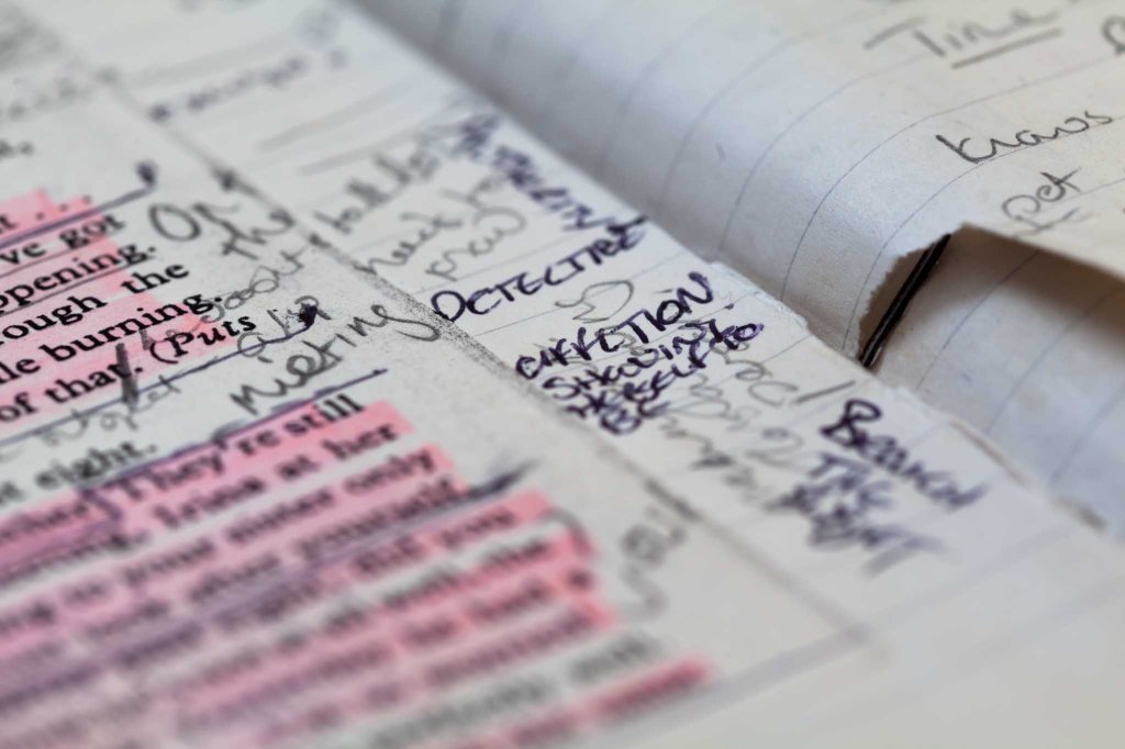
As I have mentioned in recent posts, I had little choice but to change the printing plans relatively recently. Despite the fact it was a reactionary decision, this change has led to feeling a lot freer with the content which seemed a bit constrained. I aim and hope to be able to plan more, perhaps raise money and offer a higher quality object with the original fold outs I envisaged, during SYP – and the written piece which I now have planned for the website may also end up in a secondary publication. The other outcome of this forced letting-go is the possibility of allowing the work to become a performance of some kind. This relates what I have now back to earlier ideas when I was toying with the idea of referring to the publication as a ‘script’ on the front page (a play on words) and one of the objects which inspired its development.

A working script from days as an actor was one fo the first inspirational objects for the BOW

That isn’t to say what I have now is unfinished – it is a pause with specific objects that are valuable in their own right. It’s a presentation that works for the time consisting of a printed publication, an online one, moving images and text. The printed version is a compromise but perhaps the tighter limits were good for the process.

After deciding that the original plans were out of my price range at this time, I have sent an updated version to Newspaper Club to print a test.

This is one of those times where I really regret not having access to a university print room. The choice of papers is obviously limited, however, such limits can contain you and as before when I’ve used newsprint, the democratic message that the work becomes inevitably imbued with fits very well the underlying themes. And NewspaperClub have been fantastic as ever, allowing me to opt for an older larger size (which I accidentally stumbled upon) and explaining everything so patiently.

But I had not designed this with newsprint in mind so it has been crucial to see a test print. You definitely see things differently when the object is in your hand and not a collection of pixels. I am immensely grateful that the test costs so little with NC and you are offered a voucher to subtract from the sum of a print run so in the end it’s free if you go ahead with them. However, the test for a mini newspaper which is slightly bigger sized zine is not sequenced correctly and printed as if it’s a tabloid. So you don’t get to the see the spreads as they would be or the sequencing but you do get to see how the colours work or don’t. But I noted the following and will be making adjustments:

  • Some of the darker images need vibrancy and colour boosting, perhaps some black lowered and a bit of lightening.
  • The lighter and colour images work well on the paper.
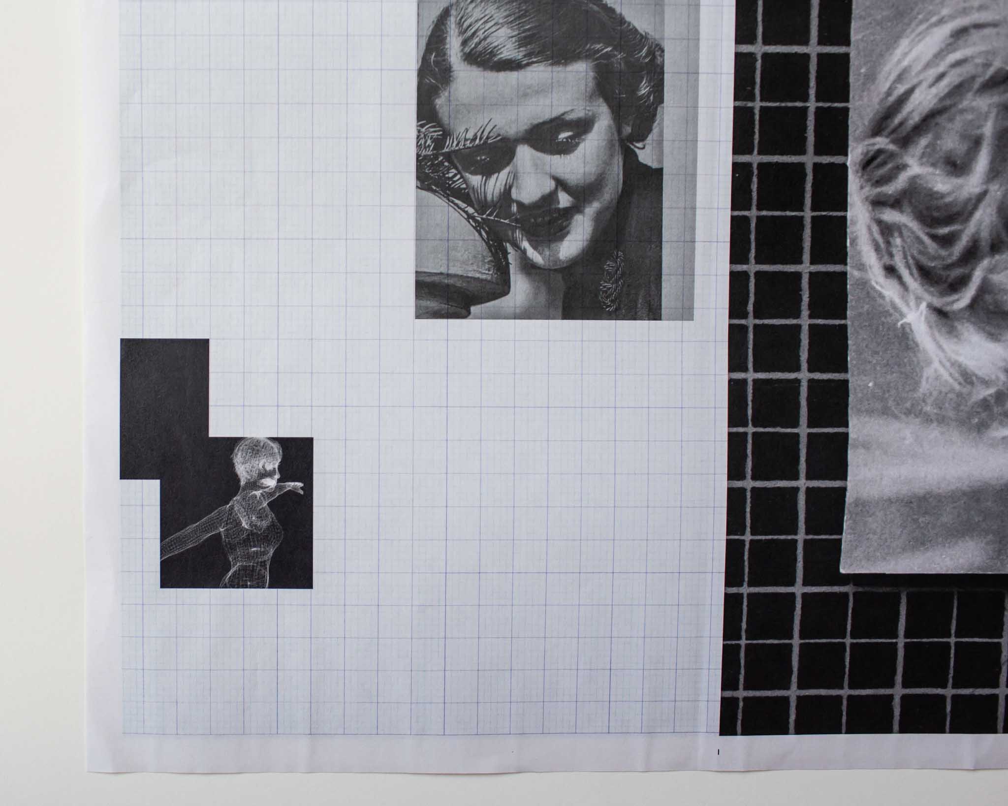
  • I really like the way the graph reproduction comes out in this paper as well as the re-photographed interference of the screen.
  • Saying the that, the screen image of the boy doesn’t work at all and I will delete it entirely.
  • If I were to make some form of exhibition with this work, I would like to to able to give away or sell for cost a newsprint version of the work and perhaps sell higher quality books – however, I want to look into print on demand options.

    I may well end up using this limited run in my PR during SYP.

    BOW A5: Print queries and responses

    I have copied and pasted the book over into a slightly bigger size. Originally it was A4. Now it is a few mm taller.  I have written to a couple of printers asking about cost as I know all my ideas will pile on the costs and if I go for half pages and different sized pages, it can’t just be ordered as a standard book from a digital book print company using their templates. However, I do recall Milk saying in their website they do handmade publications so maybe worth inquiring – although it seems nuts to ask an Australian company when there are plenty here. I am also aware that this activity pre-empts SYP but the design is integral to the overall concept so I can’t really separate it out. Scroll down for responses.

    Here is an extract of my inquiry (included here, not least because some of the concepts are outlined succinctly):

    I am working on my final Body of Work (BOW) project. It is not finished but I need to start thinking about how much money it will cost to produce, what is realistic and what might be impossible.

    […]

    It is slightly over A4 and the design is based on some Situationist Times publications (see video)

    These publications had vertical and horizontal 3/4 or 1/2 pages and I have included those too in my work for now.

    I am also thinking about the sort of maths exercise books with graph paper from my school days as an influence. Coding and decoding reality using mathematical formulas should subtly weave its way through the work.

    I would ideally like different textured paper for text (there are four pages of text inserted) like they have in a FOAM publication.

    I think of the work as a bunch of signifiers behaving like rowdy children.

    At the moment, there are coloured blocks which might indicate paper colour rather than ink. Please advise me about this.

    I’d love to hear your thoughts, suggestions and warnings.

    I have had one response so far:

    Thanks for the artwork and email.  It is a very ambitious publication and will need plenty of time to finetune and get perfect from an artwork then a production point of view.
    So, picking through the points, is the finished publication 310x216mm with a total of 48 pages?  4+44pp?
    Are you able to send over a video of a mock-up please?  The pdf is great but really doesn’t show which pages fold in which direction
    Page 8 is a fold-out? If this folds out then page 9 should be with same width because it backs up to it?  Same with 14, the next page has to be the same size?
    If you can make a mock-up you’ll see the mechanics that you need to consider with the actual paper.
    From a cost point of view, having the height at 310mm means the print costs will be double what they would at A4 (297mm).  We can use GF Smith Colorplan for the coloured papers but these will adds £100s more to the total cost in comparison with printing the colour on our white ‘house’ sheet.

    This answers some questions – I have replied:

    I will need to put something together this weekend or early next week to send over as a video.
    I am very happy to use A4 (I had a feeling that might be the case and, in fact, I think there absolutely must be some conventional standardised structure to contain the non-standardised erratic stuff.)
    I was also certain ink rather than paper colour would be cheaper so when you give me a rough idea of costs, please go with the more affordable option.
    Further answers from me:
    This [the video and dummy I made] is all VERY rough indeed but it was a helpful exercise. I made this dummy with an inkjet printer, set to fastest print speed in mono – so it really is looking at the construction more than anything else.
    As you might imagine, the sequence in my PDF is still totally up for reorganisation but the practical things that need to be fixed at this time should be – such as binding type, where the text pages and shadow puppets on half pages should go, and the gatefold construction. When I’ve done another edit, I will print a version at work on double-sided flyer paper in colour to get a much better idea and will send you a video of that once it’s ready. Below is a list of things that came out of making this dummy:
      • The book is probably not big enough to contain half vertical AND half horizontal pages. I will ditch the vertical half pages and stick only with the horizontal ones. (And a gatefold – see later)
      • The half pages should either all be in the middle of the text pages or should wrap the text pages which I think is my preference – the 4 text pages (2 x double-sided)  therefore interrupts the narrative of the shadow puppets. I have played with various options in the video.
      • (Does the above depend on whether its saddle stitch?  – and the text along with half pages being in the middle, which removes the possibility of a centre spread image – which may be fine.)
      • The text should be on a different textured paper if possible.
      • At the moment there is one gatefold. (Hope its all clear and evident in the video) I suspect that is sufficient in a book of this length. But when you give me a rough idea of cost, can you let me know what it would cost to include two, please.
      • (I also wonder what it might cost to have a gatefold that folds out for an additional page… so in the video, you will see when the spread opens out it contains 3 x A4 pages. What if it were four?)
      • I will stick with A4 rather than an alternative sizing – (this fits with the concept of classical and non-classical structure existing together and intermingling, setting up tensions between the two)
      • I will use ink where I want pages to be a different colour to avoid massively hiking up the price – but even that will be limited.
      • Saying that the cover pages might be best with a different paper as is usual  – although I used the same paper for the zine to keep costs down (recall the idea of the school-like maths exercise book being an inspiration for this work)
      • I want to avoid the stark white paper photobooks are usually printed on. One of the examples you sent me before had used recycled paper. I like that idea  – and wondered, is it a bit creamy in its naked state?
      • If I do use ink to change the colour of any pages it should be on the whole spread so that if its on page 5 (inc. cover in numbering) in one half of the book it should also be that colour on page 36 (think that’s right!) – especially if it’s saddle stitch.
      • I think I may have seen 40 pages as the limit for that binding- maybe only in zines? I’ll await your guidance on that.


    BOW & CS: Research SEM

    Yesterday as I travelled to the Optical Science Laboratory at UCL (thanks to the generosity of one of my son’s friend’s dad who works there) I was reading about Brittlestars in Barad’s book, Meeting the Universe Halfway (2007) which is over ten years old so slightly out of date  – but she was very excited about then new research which stated that the Brittlestar is one giant eye. By 2018, what was being reported was subtly different but still entailed an alternative way of ‘seeing’ ( to ours – or else ascertaining what and how the surrounding environment is understood by other beings). The following was reported more recently in Nature

    “There’s a growing understanding that the ability to see without eyes or eye-like structures, called extraocular photoreception, is more widespread than we thought,” says Julia Sigwart, an evolutionary biologist at Queen’s University Belfast, UK, and a study co-author. Many animals, including sea urchins and some small crustaceans, use this mechanism to sense their surroundings3. Brittlestars are just the latest addition to the list.

    “Sensing the environment and responding to a stimulus without having to wait for that signal to go all the way to the brain can save a lot of time,” Sigwart says. And the idea could inspire the development of robots and image-recognition technology that don’t rely on a central control system, she adds.

    As for the crystal structures that researchers thought acted as microlenses, “they’re just part of the skeleton,” Sigwart says. Their transparency and ability to focus light is “completely coincidental”, she adds. [This is what Barad was describing in her book]

    But Hendler disagrees. “They could still conduct light into the skeleton,” he says. “I’m not ruling out the possibility that they have some optical function.” (Gugleimi, 2018)

    Gugleimi, G. 2018, How brittlestars ‘see’ without eyes, Nature, [online] Available at: https://www.nature.com/articles/d41586-018-01065-7 Accessed 19/02/2019

    I have been thinking about Hoffman’s book, The Case Against Reality (2019) a lot and how its hypothesis needs to be included in the CS essay – and can’t help but wonder, what if we humans could live as a brittlestar for a few moments – and then return to this human life to compare notes.

    At UCL I and got to spend the day trying to figure out how to use an SEM machine (there is an SEM image in the Brittlestar article above – it’s MUCH better than anything I achieved). As Barad explains when describing STM, the bigger more powerful microscope out of the two  – the way the machines ‘see’ is almost like a blind person might with their white stick. It feels, or in the case of the SEM reads the electric field at the end of its probe, sensing the terrain and sends the information back to the computer which then renders it to an image our brains recognise.

    I learned that the hardest thing, working at this level, is to get the probe cut correctly. We had to cut it ourselves and unless you do it well enough it simply won’t work. Or it will render the image poorly. The tip of the probe needs to be one atom wide. And it can be easily damaged which is why you have to cut it yourself with plyers.

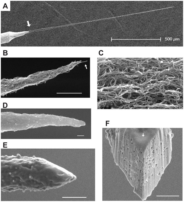
    SEM-images-of-CNT-probes-A-Low-magnification-view-of-a-CNT-probe-Tungsten-wire_W640

    The example I was shown was more like a mountaintop, but here are some other probe points from https://www.researchgate.net/publication/248385439_Intracellular_Neural_Recording_with_Pure_Carbon_Nanotube_Probes/figures?lo=1

    We spent hours trying and failing to get anything at all. Apparently, the students get marked quite highly or not for this experiment.

    The other SEM images on the computer were all far better than my own one and I don’t think I will use mine in the book –  but I was fascinated by the process and it will definitely feed into the book/work/essay. However, I will I hope return to do a still life of the tools we used as the colour of the handles is rather strangely the very same blue as the cows’ eyes (which I’ve not posted here yet – planning to do a contact sheet at some point soon). I think this may make a worthwhile juxtaposition.

    Here are some of my efforts. Huge thanks to Peter Doel and his colleague for allowing me to explore this different way of seeing.

    We did get an image of a range of atoms (I think) although it is not even, which is the ideal aim.