Yesterday I said to someone I know, I do hope I at least the money back I’ve paid out for the production of the zines. He said – you will over time, and don’t underestimate the value of having done it in the first place. What I’ve learned in the process will be beneficial to the final project and beyond – and I was reminded that some aspects precede the final module – SYP. For that reason, I am jotting down some figures and practicalities here.
Proof
£38 – this seemed costly and added a significant amount – but I was very glad to have done it. Even though, I’m still not even sure the images will be tonally-corrected to my satisfaction – seeing the way the spreads behaved and interacted, where the staples were, what was in the middle, the white spaces peaking through the middle was all very valuable. I made changes to layout and sequence prompted by the proof.
Zines
When I first approached ExWhyZed, I asked for a slightly thicker cover, they suggested thinking about using the same paper to keep costs low. I also asked for a quote for 25 which was so marginally less expensive that 50 that it seemed daft not to go for the higher figure. If I’d thought I could have sold 100, that would have been even more economical.
A5 booklets, Self Cover 90gsm, Uncoated
Black print throughout
Trimmed, collated, wire stitched
= £102
Postage
2nd class 65p / 1st class 76p per item
Envelopes
£6 for 50 black envelopes. I thought about a plastic inner wrapper/bag (I have some A3 ones already to selling prints at an art fair a few years ago which have come in handy with assessment submissions) but then thought – no to plastic – so saves on the cost of such bags as well.
Upgrading my website so it can receive money and orders
I looked at various options. I could have done this through WordProcess which theoretically looked cheaper but I’d have needed to pay a whole year upfront and with Squarespace, I can downgrade my monthly sub anytime. I could also have simply sent people my PayPal address but there is something a bit ‘not right’ about that method. Rather than £13 PCM it’s now £25, not ideal, but still much cheaper than previous websites. At some point, I wonder if I’ll delete the SmugMug site – will see what happens after this lockdown. I do like keeping the two strands sperate and SmugMug is super-inexpensive. I guess it depends on if I continue to see ‘art’ as something that can indeed be sold. (My mum suggested doing a zine like this every quarter – I pointed out I’d need to be aiming for more than a couple of hundred ££s quarter to live on!)
Now that I have this commerce facility, I should think about adding other items. But one step at a time and I really need to be careful about what I put there.
Ways I could have done this cheaper
I could have printed and handmade the zines myself. Although this might seem an obvious one, the cost time and labour would have completely outweighed the benefits of having it printed professionally. However, I will probably offer individual prints and may do those myself – I trust the black and white printing of this Canon but not colour for now. I also know someone who works at a university print room who could have done this at a fraction of the cost although I’m not sure if she’s able to do more than the occasional one off prints.
Thanks to Rob (within the OCA) and Nicola Morely for their advice about setting up the commerce aspect of my site.
Online galleries
I have been sent several standard letters asking me if I want to submit my work to galleries. I tested the water by filling out one such application and was accepted although I’ve not added anything yet. Nor do I know if I will with that particular one but it’s good to know I get offered and accepted and will pursue this avenue in a little while when things have settled into a new routine here. I still have one sick child and we’re following the term dates so are ‘on holiday’ right now, plus I’ve got admin for the part-time day job so everything has to be done in a measured and timely way. Let’s see how things pan out.
Finally, I’ve made it through to the second round for something I submitted work for – will say more if and when it progresses. (Was a good bit of news last week, in the midst of all this sadness).
Converted whole doc. to greyscale in Adobe preflight, thanks to ExWHyZed showing me how to.
Noticed the darks losing some white again. Must go back to a couple of images and lighten further.
I have adjusted the text and added an image to the inside of the front cover.
Made some further minor adjustments after friend subbed and others made final comments.
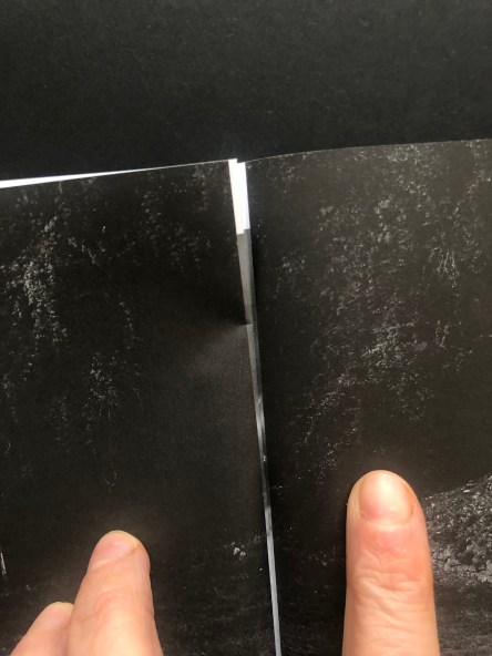
Spread No. 18 needs adjusting as its corresponding page spread No. 9 has white on the edges and it peeks through. Need to resolve. May do by putting it in the same sized frames. Have learned sometimes, sequence dictated in part by practicalities.
Seeing the proof has been very helpful. There are several things I need to adjust:
Sequence – I’ve shifted the images so the center spread is now a single image, full-bleed. The way it was before, the right-hand side was blank, so that when you turned to two pages later, you came to a dark double-spread, full-bleed which was interrupted by a slight bit of the middle spread’s whiteness peeking through. I think the double spread in the center will be best and it also solves that very slight intrusion. I’m not sure I’ll catch all of these but would prefer to: if there’s a double-page spread then the corresponding printed page earlier or later in the book needs to be dark. The centre one is fine now – it’s the football posts (before it was the eye looking up). I’ve not noticed it anywhere else. There are three full-bleed double-page spreads to watch out for.
Sequence, I am looking again at the sequence, having shifted things as above, some other pairings might have been lost and will need addressing. Currently, it’s like this – after shifting the centre.
I need to address what to do with the text. I have tried it on the first two pages but then the book had to shrink from its original size – it’s now a standard A5. So it didn’t fit as was and I spread the text over three pages, (actual page numbers, not spreads as numbered above) P5 – text only, P6 image and text, P8 had a tiny piece of text and image on right-hand side page – waving goodbye or hello) But then that seemed messy and I squeezed it in so back to P5, and P6. But I am not satisfied with the layout and am looking at other options.
P2 is blank – inside cover, but the back inside cover isn’t – due to the page limit. I think that means P2 should have a small image on it or maybe solve the problem of the text and try to have it on the inside cover with less blank space. I mentioned this yesterday and everyone said, no, keep the inside cover blank – but I am not certain. As the inside back cover has print on it, I feel the inside front should too. The alternative is to remove a spread and free up space in the book of 40 pages (limit with this stapled book from ExWhyZed) and have blank inside covers at both ends but this is a zine, not a book so print on the inner covers is fine.
Some of the images, as I knew, need to be lightened but the difference on the screen and paper is quite stark so I have asked if there is a print profile for this particular paper – I didn’t see one before – but I’d like to be more certain of the how the darks are going to behave. I’m sure they must have these but there was no mention of them, perhaps they want to keep things easy for people or perhaps I just missed the bleeding obvious, as is my wont. Am waiting to hear.
Hazel and Rob talked about the difficulties of progressing with SYP now that we are all in lockdown and everything has been shut. Both are in a kind of limbo and I look forward to seeing how they find ways to do what they need to do through these extremely challenging times.
I discussed where I was with the zine and how BOW A4 had taken a slight back seat for a while. Some useful questions were asked and they will be helpful to document as my answers summarise where I’m at and what the work is attempting to explore.
I mentioned I was planning to order 50 copies of the zine and try to sell them as I need to find ways to bring in some kind of income. As we were discussing SYP, it became clear I was inadvertently tackling elements of that module (see item 2). I had looked at some callouts – Inside Out are doing one but you get paid £80 only – and that’s if they choose your work. They might not even choose mine. This way, all the profits come back to me. Since people are keen to help artists and self-employed people at this time, I hope I am not being unrealistic about people buying them. I had asked for a quote for 25 as that seemed a manageable amount to sell but when the figures came back it just seemed more sensible and economical to order 50. Of course, if we had access to a normal uni print room we might all do this much more economically but I am very impressed with ExWhyZed so far.
I talked about how pleased I was with tutor Jayne’s comments – ‘Your zine content and layout does a great job of presenting complex ideas in a creative way that’s both sophisticated and accessible’ (TV Padlet, 2020) because that was my intention exactly. To make something accessible that would stand the biggest chance of being sold while also managing to maintain something of my (complex) underlying themes (an SYP discussion point apparently). It’s why I went with this black and white aesthetic which people without PhDs in photography enjoy.
I suggested a cost of £7 – we all agreed £7.50 would be a good figure to cover postage and the cost of the proof.
Doug asked me a very good question which I need to be able to answer clearly and succinctly. How does the zine fit with the overall BOW work?
My answer –
i. The zine includes creative writing and image. It was only after Ruth was so encouraging about the writing when initially submitting A2 that I had the confidence to pursue a creative writing/image path. So this is the first step in that direction. (see an earlier post about how I came to use these particular images with this writing.) Also – this article about ‘art writing’ will be useful to reference in my submission, especially with the later project.
ii. The underlying themes feed both works, the zine (A2) and the book (A4/5) – i.e. systems change as seen through linguistic and image signification/structural reality. I hope the statement at the back of the zine hints at this – also on my website
iii. I was glad when Michael pointed out how relevant this was to the current situation – I explained, that is why I am not rushing to make work about COVID-19. There is a lot of noise and it just seems for me the best thing to do is try to stay focused on my work and keep going, let the world filter through as I always do. I am already making work about systems change, morphology, the chaos – autopoiesis. There is a really good and relevant passage in Capra’s Systems View of Life which describes how systems do this – I will make some time to find it and post here later.
Rob has offered to help me figure how to get the sales facility up and running on my site which I am grateful for. I think I might need to upgrade my Squarespace subscription though.
The zine arrived while I was on the hangout. I’m so glad I ordered a proof for more reasons than just checking out the tone. I will discuss these in a separate post. Tomorrow’s ‘me’ time will be about making tonal adjustments to a few images and moving some text about.
Learned a lot about printing with bleed using ExWHyZed guidelines. I hope it is correct. Will see – added 3cm margin beyond he page at first and wondered why it needed such a big margin of error – doh! Caught my mistake and it now has the suggested 3mm. (Artwork has been verified as all good except for a colour cast – see below)
There are also some minor changes to text and sequence, plus the other changes I mentioned before.
I am learning a lot printing this and glad to be doing it with this A2 before embarking on A5. I should have taken each image into photoshop and converted it to black and white rather than just doing it in Lightroom – there is a green cast that I started noticing yesterday as I got it ready and look in Adobe. The whole file will be converted and I have ordered a proof. I will adjust the contrast on darker images once I can see what ones could do with some lighting. I suspect I know which ones but it will be good to see. I’ll need to add a £ to the cost to cover the cost of the proof, but I think its worth it. It will still be low for people.
I have a quote for printing and now need to look again at the images. I have also been looking at the intro/statement about the work taking some feedback from John into account.
A1 – A film montage appropriating old sci-fi movie which, in retrospect, fits very neatly with the direction of BOW – sirens, mythology, cinema, the female form, feminism, post-structuralism
A2 – (originally submitted here) veered off in a different direction while working with Pic London, but re-identified the importance of text/my own writing in my own work. Also explored notion of ‘objects’ and assemblages which have played a significant role since – relating to agential realism and I have recently discovered important in Deleuzian thought.
While working on Pic London work I was in Italy making two different types of image – one with flash, one without. I have rendered the ones without black and white – this conveys the darkness in a way colour doesn’t seem to in these images and the flash ones are also all about isolating objects in the darkness. And darkness was an important keyword in the background of Pic London group discussions for a variety of reasons – it ends up in my writing too as the women sit in the darkness waiting to see dying stars.
Additionally, the research booklet created by my group for Pic London has influenced some of my ideas/explorations for the overall BOW.
Darkness and objects are key visual cues in the A2 project.
I feel I have two projects unfolding for BOW
The book which I submitted as Cuttings for A3 and which I will likely change to Script for A4 as I continue developing.
Another book which sits outside that work – as a separate project currently titled This Family Too.
A1 might be shown alongside two projects I made for DI&C in an installation for the Cutting/Script work – all of which focus on the way the film industry contain our myths and shape our landscapes.
This post is aimed at recording developments for A2 – This Family Too (working title)
Two groups, taken last summer in Italy as we wondered what would happen with Brexit. Soe the same here but different crops or rendering. (click on individual image)
As with the overall project, there are key ways of seeing which underpin the way I want to put the work together and communicate:
Repetition and difference/Diffraction
Entanglement/Rhizome
Group 1
Group 2
I have ordered 5x4s and 6x4s so I can figure out if these images can work together in any way and the sequencing.
Here is an early idea of how a zine might look – Mono only
I am definitely making this as a zine and will offer to sell for £10 or so online, regardless of OCA. But I have yet to decide whether I submit it as A2 – a slight diversion from the main BOW of not – or just as an example of offshoot work that came about during the making of the main work, or to simply get on with it as a separate enterprise altogether. It’s very different from the main work in terms of genre but it contains approaches, subject and underlying philosophies that I am exploring.
Since sending out various versions of work and receiving the feedback I have developed the overall concept and presentation further – seeing what could be ditched but also how I would bring some of the various elements I had created together into an ‘assemblage‘.
I do not much like the word assemblage but after reading it used (a great deal) in a blog by Deborah Lupton, the author of Data Selves: More-than-Human Perspectives, it seems like the correct word for the collection of images, sounds and materials I’ve gathered together. She writes:
I examine the interplay of human and nonhuman affordances associated with digital technologies – devices, software and the digital data they generate – and the agential capacities that are opened up or closed off as these things assemble. I ponder the questions of who benefits from these agential capacities, and in whose interests they operate. Here again, affective forces are central to the engagements of humans with these nonhuman things and the capacities that are generated by their gatherings. I address how human-data assemblages can generate agential capacities that empower and vitalise actors in the assemblage; but can also expose them to vulnerabilities and harms.
This approach recognises the entanglements of personal digital data assemblages with human action, reaction and understanding of the world. Personal digital data assemblages are partly comprised of information about human action, but their materialisations are also the products of human action, and these materialisations can influence future human action. While digital data assemblages are often conceptualised as immaterial, invisible and intangible, I contend that they are things that are generated in and through material devices (smartphones, computers, sensors), stored in material archives (data repositories), materialised in a range of formats that invite human sensory responses and have material effects on human bodies (documenting and having recursive effects on human flesh). (2019)
I am therefore creating an assemblage although I have not used this word.
The assemblage consists of:
A video – itself a collage, a type of assemblage. While not a still collage like Höch’s were, it was made to emulate that trope, cutting up and pasting material that exists in the world. It includes audiovisual material that is available on the internet but contains signifiers of earlier technology. It will be shown on a Kindle – a handheld device.
The film will also be available on my website but it will be a different version. Mostly the same apart from one or two tiny sections, but with an alternative audio track. The instruction to visit the website is printed on newsprint and is part of the assemblage.
Still frames from the film which have been ‘captured’ and frozen – in more or less the same way a photograph of life is captured and rendered a still image, using a slightly different tech/method – and printed on newsprint. These will be placed on the platform or hung from sticks.
The poem printed on a tabloid page, orientated portrait. I hope this will hang above and slightly behind the kindle, perhaps alongside printed newsprints but I will need to see how this pans out when we set up. I was very influenced a long time ago by Louise Bourgious’ He Disappeared into Complete Silence. This is a book with several plates each of which consists of text and a drawing. The drawing is not an illustration. And sometimes it is hard to make the connection. But they are made to be seen together. I feel the poem and the video work this way too. Each can stand on its own but the point of the work is only brought to the fore when they are placed beside each other: A moving image piece alongside text, working with it but not illustrating. I might have read/performed the text in a video or even live. But this did not feel the right place (collaboration) for that – perhaps I might have reached a way of doing this if we’d had longer or were working in a smaller group -and it is something to consider for the longer-term, BOW-wise.
The work will exist in a ‘village’ (the platform) alongside other work made by my collaborators. The contents were influenced by their interests and the interactions I had with them. It is a reflection of them and my time with them. So my work is part of a greater assemblage, a network of creators which itself exists within a further larger assemblage – i.e. the three groups organised/curated by Pic London. That too is an assemblage which is again part of something greater. And so on = the fractal nature of existence.
Looking back, this is the pattern of my work. And now I know why. I am not focusing on one tiny aspect. I am recreating the chaos and interaction of conscious experience (not an individual, not an isolated and alienated concept, not one thing).
When I submit the assignment I will include critical information I sent to Pic London – but here since it is relevant, I will just add a quotation I used which I have inserted into my work previously, and put at the front of my Self & Other blog:
“There is no such thing as a single human being, pure and simple unmixed with other human beings … [the self] is a composite structure … formed out of countless never-ending influences and exchanges… we are members of one another.” (Joan Riviere, 1927) It seems the assemblage whether it’s made up of flesh or tech or both and all sorts of other stuff is a description of Riviere’s statement.
I have removed my own images taken with flash. I really don’t know what to do with the poem or those pictures. I don’t think they fit but are part of the process.
Or else, if they are anything, they are separate albeit related work.
Ruth really liked the poem and I am glad she did. But every time I think about adding it in some way, I feel now like I am shoe-horning it in. When I look at Ruth’s work, I think I can see why this appeals to her more than the montage film.
Here is the film as it is today. Same password as before.
But it does repeat what I have done before.
After thinking about adding the poem and images to the film in some at the end as an epilogue perhaps, I will now try somethings out with it in PS or Illustrator. I read yesterday in a group email from someone who attended Unseen in Amsterdam that much of the work was alternative processes and that there were hardly any digital prints at all. Why would everyone rush to do the same thing? I will keep exploring digital – how can we not at this time in our history? When digital is having such an effect?
The following are some specific influences in the work I’m making for BOW 1.2 (actually A2 in the file but I’ve been referring to it as A1.2 all this time…)
I learned about Joan Jonas last year during her show at the Tate and so much was useful for my own practice – such as layering moving image, sometimes mixing performance with other mediums, and all related to working from a feminist perspective, eschewing or perhaps exploring and offering alternatives to historical-artistic habits which might be construed as coming from the masculine i.e. relating it Irigray’s suggestion that the female subject cannot exist within current constructs. But perhaps one of the most helpful things Jonas said was when she asked viewers not to try and understand her work, but rather, allow themselves to experience it.
“My work is all about layering, because I think that’s the way our brains function.” Jonas argues that we always see and think of several things concurrently: “We see one picture and there’s another picture on top of it. And so I think in a way my work represents that way of seeing the world – putting things together in order to say something.” When Jonas started incorporating video into her performances in 1970, this presented new technical possibilities as she could not only do everything herself, but was also able to show different aspects simultaneously. Furthermore, it provided her with new ways of exploring the notion of “female imagery” in the prime of the feminist movement: “Women were kind of bursting out of their seams.” (2016)
Jonas makes work which attempts to operate in a different realm where instinct isn’t jettisoned and emotions are triggered although we may not fully comprehend why. And that is the kind of work I am experimenting with. I do this by trying not to think about what and how I’m making the work too much, influenced by Dada and Surrealism – and automatic writing. I might simply grab footage that appeals to me in some way, perhaps it is related loosely to themes I’m investigating, and then edit them together without thinking too carefully, to begin with. When I look at what I’ve made, I can find meaning and signifiers that make some sense (to me at any rate) and might develop certain threads which I recognise as having a connection.
2. Re-evaluation of strict rational/logical
I do not eschew rationality but we have throughout Western history (Logocentricism) valued it more highly than instinct in our culture. However, there are many instances nowadays in popular culture where the non-rational is being re-examined and celebrated – any superhero film, but also and more specifically, although the list is much longer than this: Inception (2010) film, The Lost Room, (2006) TV, The OA, (2016/19) TV, Russion Doll (2019) TV. (I do plan to write about the bleakness in many of these shows and relate it to Leckey’s work – see below as well as the blurring of boundaries between life and death, this world and some other world, about the loss of reality which might also be described by some as ‘the end of history – Hegel etc.).
Neuroscientists are also more inclined nowadays to suggest non-rational thought has been under-valued, instinct has something positive to offer, and that we may have lost something along the way.
“Indeed, relying on your intuition generally has a bad reputation, especially in the Western part of the world where analytic thinking has been steadily promoted over the past decades. Gradually, many have come to think that humans have progressed from relying on primitive, magical and religious thinking to analytic and scientific thinking. As a result, they view emotions and intuition as fallible, even whimsical, tools.”
“However, this attitude is based on a myth of cognitive progress. Emotions are actually not dumb responses that always need to be ignored or even corrected by rational faculties. They are appraisals of what you have just experienced or thought of – in this sense, they are also a form of information processing.” van Mulukum (2018)
However, this revaluation of rationality also seems dangerous in many instances, such as the growth of the anti-vax movement or the Flat Earthers (I am convinced some Flat Earthers are simply ‘taking the almighty piss’ – Australia is a hoax, for instance, is just too, too mad.) Even so, I can’t help but see that the story of Cassandra as salutary – in it, the symbolic and the rational are valued but the imaginary and instinct aren’t. The feminine and the traditionally related non-rational, are dismissed as the mad ravings of a lunatic even though in the end Cassandra, condemned never to be understood, was right.
The desire to revisit tales of witchcraft (as seen in the collaborative work with Pic London – some are exploring elements) is also related to this trend. One of the workshop leaders Una Hamilton Helle is part of another collaboration – Waking the Witch:
“Traditional witchcraft has a strong connection to the earth with an intimate knowledge of herbs, plants and the elements – as well as the human body. As gatekeepers to altered consciousness witches have been both feared and sought out for their dealings with the unknown. Historically persecuted as an outsider, the witch has been taken on by artists as a challenging force to prevailing norms and as a symbol of dissidence. Looking to symbols, tools and the coven as a space for focusing collective intent, the artists in this exhibition explore the path of the witch as one for how we can connect with the earth and each other.” (wakingthewitch.uk)
3. Walter Benjamin as quoted in James Elkins What Photography is (2011)
Another reason for making work this way, is because my head is filled with fragments of emotive information gathered from a lifetime of watching films and TV.
Loc 1311 – “…film he said, creates a percussive shock to the consciousness by continuously changing scenes, “I can no longer think what I want to think.” he writes. “My thoughts have been replaced by moving images.” (The Work of Art, in Illuminations, 238)
See mention of Virillo below – who also discussed fragmentation and film.
4. Hannah Höch
I have been a fan of Höch since seeing her work at the Whitechapel when I first started with the OCA. I couldn’t believe I’d not learned about her before. Strangely before going, I was not particularly looking forward to seeing her work and didn’t think much of montage! “I didn’t think I was going to enjoy the Hannah Hoch show quite as much I as did, despite having read somewhere that it was the must-go-to show of the moment. I’m not sure why, especially as I’d been in a reenactment of The Cabaret Voltaire at Manchester Metropolitan University, shortly after graduating in 1994 and enjoyed it immensely.” (Field 2014)
“Photomontages were the original remix. In the early 20th century, a group of European artists spliced together images they’d found in popular media, creating singular artworks via a strategy of sampling. The results show both individual statements by their makers and cross-sections of visual culture from a particular historical moment… []
… one of the few female members recognized by the movement, offered a refreshing antithesis to such macho constructions. Her own photomontages offer kaleidoscopic visions of German culture during the interwar era, often from a distinctly queer, feminist perspective.” (Cohen, 2019)
Collage is a representation of fragmentation and may be an expression of the sort of continuous changing scenes as mentioned by Benjamin and also Paul Virilio who I quoted in DI&C A2.
“The cinema shows us what our consciousness is. Our consciousness is an effect of montage. There is no continuous consciousness; there are only compositions of consciousness […] collage, cutting, and splicing. We’re in the age of micro-narratives, the art of the fragment.” Paul Virilio (1932-2018)
In my work, I make collage although it is moving-image and contains audio as that is more relevant for today when we are surrounded by adverts that flicker and emit sound constantly – on our phones which we carry around but also in adverts, on escalators, everywhere. This is explored in plenty of science fictions films too, for example, Blade Runner (both 2017 and 1982) and Total Recall (1990 and 2012).
Fragmentation was embraced in theatre, and Brecht’s desire to move away from soporific shows that hypnotised people into accepting their lot in life was replaced by episodic writing of his Epic Theatre which he hoped would make people angry and to act. Ironically, TV today routinely follows the same pattern and time is chopped up and edited, especially in soap-opera’s and sit-coms which are also often accused of hypnotising the masses into accepting their lot in life.
5. Mark Leckey
I had not heard of Mark Leckey until my friend, a filmmaker who I showed DI&C A5 to, said that the first section reminded her of Leckey’s Fiorucci Made Me Hardcore (1990). Then Catherine (OCA student) suggested meeting up and we chose Leckey’s new show at Tate Britain – O’ MAGIC POWER OF BLEAKNESS (thank you Catherine for kindly suggesting something she knew would be useful for me). I went along and watched the film and spent the whole time thinking, “F*%K! This guy is doing what I do and including signifiers such as networks and space and noise and computer-generated pixels. Except he has way more money and lots of amazing audio and huge screens and other equipment with which to do it!! I am very much committed to a Brechtian eschewing of expense and prefer to embrace using everyday objects, to beg, borrow and steal, to creating Heath-Robinson contraptions. But I was nevertheless somewhat envious as I’m currently desperately trying to bring something together with no money and no tech skills.
However, watching his work also gave me the confidence to keep going.
The overriding sense was, as mentioned in the title, bleakness. The AO (Netflix) also generates something of this in relation to youth culture – and it is this bleakness and indeed horror which sends the characters into different realms. (Which of course also relates to quantum suggestions about multiple universes – I keep thinking about how this relates to myth in general – and the relationship between science and religion.)
Ruth suggested Painlevé’s work and they are indeed beautiful films which look at the strange and wonderful creatures that are part of our world, and which looks bizarre to us but we are no doubt horrifying to them. In my work, I look at the very small and liken their worlds to ours. What I rather like about is the music which is more like something you’d expect from a Hitchcock film. Constructing realities…
7. Rivane Neuenschwander born 1967, Cao Guimarães born 1965
Continuing from above – looking at creatures smaller than us, I loved the film described below when I saw it at Tate Modern recently. Although there is no montage here, the focus on creatures with which we share the world and who interact with us, even though we may not know it, is key.
“Quarta-Feira de Cinzas / Epilogue 2006 is a single-channel video lasting 5 minutes and 48 seconds and shown on a loop. It features a ground-level, close-up view of red and black ants carrying coloured confetti across the floor of the Brazilian rainforest. The film starts with one ant carrying a piece of gold confetti over a gritty surface, followed by shots of differently sized ants attempting to grip or drag confetti across soil and tree trunks. As the video progresses it begins to show multiple ants per scene: a pair collaborate to move a disc up a small hill, and a group fights over a piece of silver confetti.” (Karmen, 2018)
Rist was suggested as someone I might look at in feedback for BOW A1. I wrote about her in S&O. I have been influenced by her work in many ways and love how she discusses language. While thinking about how/what to do with the poem, I have been reminded about Rist’s recent work – pressed up against the glass. This glass screen image has been referenced in Netflix’s The AO too – where young people (Millenials) are imprisoned in glass tanks, like fish – unable to touch each other, as if locked behind screens and reliant on a powerful but far from perfect and punitive God-like character what manages their time/food, etc. (A metaphor for the keepers of the technology that imprisons us).
I need to work out why I thought of this. I think it came about by thinking about filming my mouth speaking the text – but this feels a bit hackneyed.
Although the poem doesn’t mention glass or social media, but as Ruth (happily) picked up on it is very much about now, about being unconnected and existing in some sort of limbo much like the imprisoned Millenials in The AO.
One of the things Ruth said about the earlier iteration of the film is that it didn’t feel political in the same way the text did. I hope by simplifying I have rectified that. (All my work aims to be deeply political).
James Elkins What Photography Is (2011)
I am adding this after writing about my Literature Review. Elkins spend a great deal of time examining the same sort of things I am referencing in the film and the poem.
The very small and the way technology is used to make the A-bomb and then dissect it. perhaps this inspection of what reality is the same inquiry into what a photograph is.


SJFIeld2019-5964-2")
SJFIeld2019-6159")
SJFIeld2019-6178")
SJFIeld2019-6205")
SJFIeld2019-6219")
SJFIeld2019-6230")
SJFIeld2019-6235")
SJFIeld2019-6257")
SJFIeld2019-6266")
SJFIeld2019-6473")
SJFIeld2019-6492")
SJFIeld2019-6497")
SJFIeld2019-6605")
SJFIeld2019-6625")
SJFIeld2019-6658")
SJFIeld2019-6675")
SJFIeld2019-6677")
SJFIeld2019-6743")
SJFIeld2019-6746")
SJFIeld2019-6857")
SJFIeld2019-6862")
SJFIeld2019-6863")
SJFIeld2019-6875")
SJFIeld2019-6926")
SJFIeld2019-6933")
SJFIeld2019-7022")
SJFIeld2019-7031")
SJFIeld2019-7071")
SJFIeld2019-7301")
SJFIeld2019-7303")
SJFIeld2019-7356")
SJFIeld2019-7357")
SJFIeld2019-7365")
SJFIeld2019-7367")
SJFIeld2019-7371")
SJFIeld2019-7373")
SJFIeld2019-7440")
SJFIeld2019-7485")
SJFIeld2019-7520")
SJFIeld2019-7534")
SJFIeld2019-7550")
SJFIeld2019-7611")
SJField2020-")
SJField2020-6531-2")
SJField2020-6531")
SJField2020-6535")
SJField2020-6729")
SJField2020-6730-2")
SJField2020-6730")
SJField2020-6773")
SJField2020-6777")
SJField2020-6939")
SJField2020-6958")
SJField2020-6979")
SJField2020-7007")
SJField2020-7277-2")
SJField2020-7277")
SJField2020-5964")
SJField2020-6159")
SJField2020-6205")
SJField2020-6219")
SJField2020-6257")
SJField2020-6266")
SJField2020-6473")
SJField2020-6605")
SJField2020-6677")
SJField2020-6743")
SJField2020-6746")
SJField2020-6857")
SJField2020-6863")
SJField2020-7014")
SJField2020-7032")
SJField2020-7071")
SJField2020-7301")
SJField2020-7356")
SJField2020-7357")
SJField2020-7365")
SJField2020-7367")
SJField2020-7371")
SJField2020-7440")
SJField2020-7485")
SJField2020-7550")


