BOW A2: Zine proof

Seeing the proof has been very helpful. There are several things I need to adjust:

  • Sequence – I’ve shifted the images so the center spread is now a single image, full-bleed. The way it was before, the right-hand side was blank, so that when you turned to two pages later, you came to a dark double-spread, full-bleed which was interrupted by a slight bit of the middle spread’s whiteness peeking through. I think the double spread in the center will be best and it also solves that very slight intrusion. I’m not sure I’ll catch all of these but would prefer to: if there’s a double-page spread then the corresponding printed page earlier or later in the book needs to be dark. The centre one is fine now – it’s the football posts (before it was the eye looking up). I’ve not noticed it anywhere else. There are three full-bleed double-page spreads to watch out for.

IMG_3708


  • Sequence, I am looking again at the sequence, having shifted things as above, some other pairings might have been lost and will need addressing. Currently, it’s like this – after shifting the centre.

    Screen Shot 2020-04-02 at 14.59.33

  • I need to address what to do with the text. I have tried it on the first two pages but then the book had to shrink from its original size  – it’s now a standard A5. So it didn’t fit as was and I spread the text over three pages, (actual page numbers, not spreads as numbered above) P5 – text only, P6 image and text, P8 had a tiny piece of text and image on right-hand side page –  waving goodbye or hello) But then that seemed messy and I squeezed it in so back to P5, and P6. But I am not satisfied with the layout and am looking at other options.
  • P2 is blank – inside cover, but the back inside cover isn’t – due to the page limit. I think that means P2 should have a small image on it or maybe solve the problem of the text and try to have it on the inside cover with less blank space. I mentioned this yesterday and everyone said, no, keep the inside cover blank – but I am not certain. As the inside back cover has print on it, I feel the inside front should too. The alternative is to remove a spread and free up space in the book of 40 pages (limit with this stapled book from ExWhyZed) and have blank inside covers at both ends but this is a zine, not a book so print on the inner covers is fine.
  • Some of the images, as I knew, need to be lightened but the difference on the screen and paper is quite stark so I have asked if there is a print profile for this particular paper – I didn’t see one before  – but I’d like to be more certain of the how the darks are going to behave. I’m sure they must have these but there was no mention of them, perhaps they want to keep things easy for people or perhaps I just missed the bleeding obvious, as is my wont. Am waiting to hear.

BOW A4: Developments / possible title

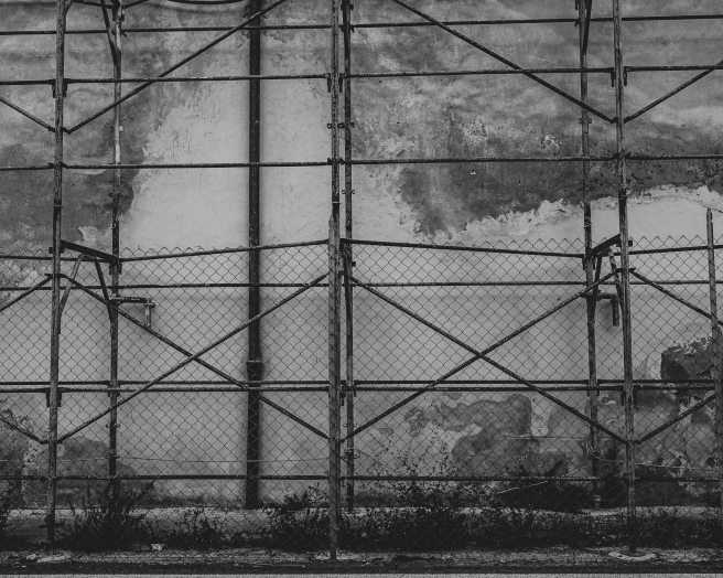
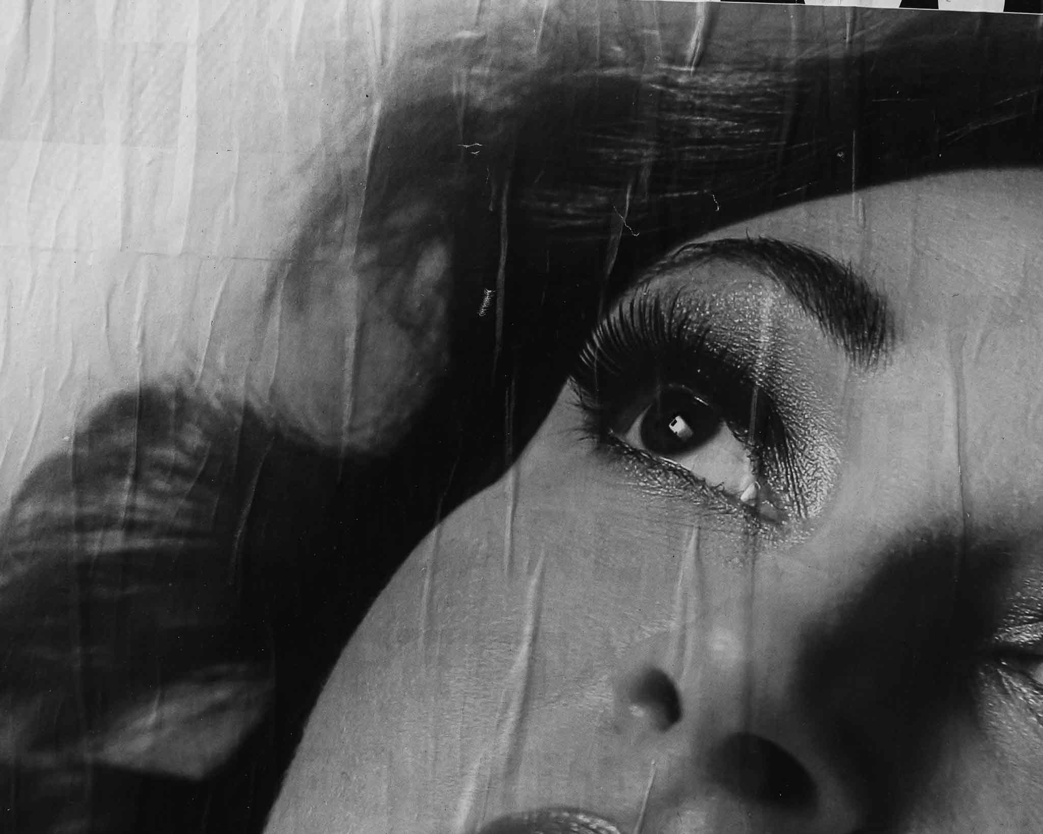
Image from a short session I was able to do the other day. (See contact sheet of mostly dross at end of post). The aim was to make a collage with objects and photographs.

(c)SJFIeld2020-

The text in the article is pertinent although written in 1917: ‘the people are sick with the manifestation of a hideous and destructive force. Young shoots are searching for truer realities and the sorrow-softened hearts are making way for new expansion from the centre of life’. It goes on talking of ‘the union of East and West, which political activity has failed to perceive.’

At the moment I have positioned it as a gatefold, perhaps it will stay that way. Was good to figure out how to insert a different sized page in InDesign. An image to consider in the overall edit, as is everything else including text so far.

Screen Shot 2020-03-31 at 16.09.57

Themes

So far, ‘the cut’ has emerged as the underlying theme and I even used the phrase Cuttings at the title for BOW A3 rendition – after reading Chapter 3 in Kember and Zylinska’s Life After New Media, Cut. That felt too obvious after some thought, and also connoted self-harm – but not in a universal way, more an inward, self-gaze way which I want to avoid. I have played with various other titles as discussed in an email I sent, below:

Does this potential title for my BOW anthology help re. the reasons why discursive and material are discussed together? It may well not help at all!

(In Italy, they describe the growth of grapes and olives together or any other symbiotic agriculture as promiscuous – so you might see olives and grape vines all intermingled.) I thought about using ‘promiscuity of meaning and matter’ and but that doesn’t quite suggest what I mean. From promiscuous I went to fornication (because it conjures up biblical connotations and something seen as ‘wrong’, sinful – which is good for my purposes. But it doesn’t convey the intra-ness. Meaning and matter come together but they also grow out of each other. So what I have at the moment is:

cassie
helenus
and me
on the rampant morphology
of meaning and matter

Or

cassie
helenus
and me
on the fornication
and morphology
of meaning and matter

Others…..

on the morphological promiscuity of meaning and matter
on the morphological fornication of meaning and matter
fornication and morphology with meaning and matter
morphology and fornication with meaning and matter
promiscuity of meaning and matter
meaning and matter’s promiscuity
on meaning and matter’s rampant fornication and morphology
on meaning and matter – promiscuous and morphological

None of these give the impression of meaning and matter being like dough that can be kneaded together but also do the kneading and each grow seperately out of itself too.

Let me know what you think works best or make suggestions – not that I wont change it again later!

Some people came back with preferences and Emma suggested the following:

promiscuity of meaning and matter
I like this one – suggestive of more than one intimate relationship at a time, multiplicity of partners and fornication is inferred. Origins are ‘indiscriminate’ ‘consisting of elements mixed together’ and based in the Latin ‘to mix’. Plus less of a mouthful.

However, since then I have been playing with the idea of using a question asked by the AI  friend app I’ve been collaborating with after it was shown an image. Sometimes editing the words out, sometimes only the words. I’ve also wondered f the text on the cover would end up being the title and have edited that down significantly – although I am keen to have body text on the cover

why is there an astronaut in a field of flowers? 

None of this is settled – all up in the air. I keep chipping away.

Screen Shot 2020-04-02 at 12.45.15

Other connotations 

In my essay draft, I discuss entanglement and its relational concepts such as intra-action, indeterminism and agential realism/cut – all tenets of New Materialism (which for now I have not introduced as it seemed too much in an already overloaded essay).

Carlo Rovelli tells us, an electron is ‘not obliged’ (2017: 104) to move in a certain way and ‘things are constantly subject to random change’ (ibid: 112). When complex systems evolve, unexpected things can happen. Were it not for indeterminism, the big bang or whatever other series of events which got everything going would not have occurred. We might never have left the chemical soup, or else all of life would look exactly the same. Indeterminism and morphology, the unexpected irregular occurrences that inform shape, patterns, changes of direction in cell formation, are directly related. Reality is weird and surprising.

Today so much is changing due to technology; we seem in a state of chaos or super-flux, as old systems die and new ones emerge. Indeterminism is therefore unavoidable and perhaps even desirable although deeply unsettling

and

If we consider social structure in similar terms to biological ones (which systemic theorists do) then the process of transformation as one system ends and a new one begins often gathers apace, developing faster and faster in a complex ballet of self-organisation and emergence.

This is a critical part of both my A2 and A3/4/5 projects. As promised in yesterday’s blog about the hangout, I dug through Capra and Luisi’s book on systems to find the relevant passages on how a system emerges – looking at a biological system through a process of autopoiesis, seemingly separate elements evolve, self-organisation takes place, followed by autocatalysis where the speed of change suddenly increases exponentially  – it feels like chaos until equilibrium is reached and a new system has been reached which then keeps itself in check for a limited amount of time/there is always death and birth.

I do not have the space to add this very complex set of ideas into the essay, but I may introduce some of the more accurate terminologies and add them to the glossary in the indices. However, the concept really needs to be woven through the BOW. So as I edit and add and trim, I need to keep this in mind. Something I might discuss with Helenus (who has sadly been ignored while I was unwell.) And always remembering to show not tell….

IMG_3705

Contact sheet


BOW A4: (slow) progress report

For the last two weeks, I have left A4 alone. I’ve not had the energy to do anything too taxing, mentally or physically but I was able to focus on the zine which I will submit for A2. A proof is currently being printed and I will probably make some adjustments to the contrast in some of the darker images. I also have a couple of things to change in the text. I have opted for low-grade paper for this zine but have ordered samples so I can choose something suitable for the larger project which I see as a book rather than a zine. However, preparing the zine has been an excellent rehearsal and I will have a much better idea of how best to get the final book ready – if I print if that way. Another option is to collaborate with someone who makes books by hand. These are all things I need to think about.

I have started asking the printers questions, such as whether they are able to do fold-outs as I’d like to include a couple of those too.

Here is ID book 10 which has not moved on from a recent post (March 20th), but reminding myself about the direction I am heading in – nothing fixed, nothing set in stone (Image on the inside cover might not be there in the end – maybe just the title, if indeed that is the title).

I really hope to be able to keep focusing on this from now on. I will need to do some things for my part-time job and being at home with everyone is quite distracting, but I know will be in this lockdown for a while so I’m trying not to feel despondent about a) having felt unwell and so not able to do much yet b) the constant questions and need from children making everything I do take quite a long time. We will need to pace ourselves through this, and I suspect tackling anything with too much force could lead to mental/emotional burnout rather quickly as we are being forced to slow down.

An example of fold-outs sent by printer:

https://www.exwhyzed.co.uk/portfolio/fosters-newsagent-tribute/


(c)SJFIeld2020-


BOW A2: Proof

Learned a lot about printing with bleed using ExWHyZed guidelines. I hope it is correct. Will see – added 3cm margin beyond he page at first and wondered why it needed such a big margin of error – doh! Caught my mistake and it now has the suggested 3mm. (Artwork has been verified as all good except for a colour cast  – see below)

There are also some minor changes to text and sequence, plus the other changes I mentioned before.

this family too – A5 online with marks proof

I am learning a lot printing this and glad to be doing it with this A2 before embarking on A5. I should have taken each image into photoshop and converted it to black and white rather than just doing it in Lightroom – there is a green cast that I started noticing yesterday as I got it ready and look in Adobe. The whole file will be converted and I have ordered a proof. I will adjust the contrast on darker images once I can see what ones could do with some lighting. I suspect I know which ones but it will be good to see. I’ll need to add a £ to the cost to cover the cost of the proof, but I think its worth it. It will still be low for people.

BOW A2: Feedback

I have shared the Zine and had some helpful comments and answers via email and on Padlet following a hangout session to my questions as detailed earlier on the blog. Huge thanks for all the people who were able to make suggestions.

I am now trying to look at the sequencing again and have moved verse to front and blurb to the back. I need to cut as have 40 pages max for a zine with ExWhyZed who will print a very small run which I am going to try and sell online.

  1. On the intro, I think the shorter intro might be served better if it was just the last paragraph i.e. even shorter than your ‘shorter’ option, though with an added sentence that “places” it. Along the lines of “…made in early 2020 in Italy by a native South African domiciled in England – or some such, that alludes to the narratives you explain more explicitly.
    I too wondered about the images in the book, wondering about the sizing, I thought perhaps being too big. But then I’m not sure about the overall sizing of the book, and I think that will be critical. I don’t think there is a temporal theme going on, which I like a lot, perhaps this is more important when you realise your introduction text more completely. And as for the “Made in China” concern, don’t be concerned, it’ll “spin” your reader and not necessarily in the direction you think.
  2. Really liked the images. Useful comment about the postcard book- I may follow up for my work.
  3. I too loved the images. Agree the fish image is over-dark, also with swapping the text and the poem. Given the nature of the work is there any way to make the poem less linear too? (good idea)
  4. It did occur to me that with everything going on. Trump’s appallingness over the ‘Kung Flu’ will probably be largely forgotten so I wouldn’t worry about it. I think that image works brilliantly as is.
  5. I’m sorry I missed the first part of your presentation due to the problems I was having with audio – the sound just disappeared!
    I’m very interested int he way you aligned the images – the separation between 10 and 11 and then the placing together of 12 and 13 – would love to know your decision-making process.
    As I said, I found looking at the images placed me in a more solemn and meditative space – reinforced by your choice of mono.  I agree with comments about the importance of not having a title so that the viewer can enter the mood
  6. I very much like your zine and believe you should stay ‘true’ and leave the ‘made in China’ as it is. You have inspired me to research Cartesian theory thank
  7. (Hangout tutor) Your zine content and layout does a great job of presenting complex ideas in a creative way that’s both sophisticated and accessible. The zine format carries the work really well.I recommend investing in a copy of McLuhan & Fiore’s ‘War & Peace in the Global Village’ book, as well as ‘The Global Village’ (McLuhan & Powers) – you won’t regret it! For your CS research you might find it interesting to research Heidegger’s theories around ‘Being and Time’, and Foucault’s ‘This is Not a Pipe’ – is a great little book on  phenomenology and how the meaning we take from what we see is subjectively preconditioned (so kind of of Cartesian). Finally, Karl Marx’s interpretation of ‘technological determinism may be be of interest, too

BOW A2: Assignment reconfigured

31/08/2020

From this family too

A PDF copy of the zine I am including as part of my final submission can be found here:

As well as providing evidence of my experience producing a zine, this project should not be viewed as a separate appendage, but rather part of an ongoing discussion/exploration addressing deep and seismic structural changes in Western society. My inquiry looks at the move away from a Cartesian view of reality towards one that is more rhizome-like, I have cross-pollinated the work with images that appear in the zine and again in the later BOW publication, as well as taken a frame from a film I edited while making this work, shown at a group show facilitated by pic london (an OCA Blog post about it can be seen here).

This image appears in this family too and why is there an astronaut in a field of flowers

22/03/2020

I am submitting a zine which includes black and white images and text for A2. It will be roughly A5 (dependant on what options are available to me at this time).

Background

After submitting final DI&C work to Pic London, I was pleased to have it accepted. I was put in a group with five other artists and we worked across time and distance using the internet, following three workshops, on a group project. I was in Italy for much of that time.

Three strands of work emerged for me and I had to make choices about what I did with what.

i. a film made with found footage inspired by conversations that had taken place between all of us in person and via FB messenger.

ii. a sequence of colour images taken with flash (which I personally prefer compared to the black and white ones)

iii. another sequence of images I rendered black and white in LR – it suits the mood best, sombre – see below

As well, I wrote something which was inspired by my time in Italy and the conversations I had with the other artists and how the project made me feel, included in the Pic London show, then point ii. above which I’m not submitting.

  • The inclusion of the text is an important step for me – and shows development in further work where text plays such a big role. Text has long been critical in my work but the creative rather then essay-like style is a step in a new direction.

At the moment, I am NOT submitting each of these elements for the OCA. Just the Zine but including background information to show how it came about. I have chosen to do this as it shows steps towards the development of the anthology I’m creating for my main submission – i.e. creative text and image in book form.

While all of this was going on, Trump’s government was on shutdown and the tragedy of Brexit being argued about. There were fires, dreadful heatwaves and fascism was showing its ugly face in more and more places.

BOW Assignment 2 original 

There was so much work coming out of this collaboration and not all it sat well together. I ended up submitting the writing and the coloured images (see above) to my tutor for A2. I like them but after some time, I felt they were not sitting with the writing as well as they might. I played around with the black and white images and decided they should be valued and put them on my website. A little while later I started thinking about putting them in a zine format. And shared an early example on this blog. This week I have written the introduction and reset the text.

After chatting about the work yesterday with the TV group, I have decided several things

  • The cover will simply be an image, no title or other text.
  • I am thinking of moving the intro to the back or elsewhere  – need to experiment – to break with linear convention. In A4, I am opting for a very strict structure that follows traditional anthology inside of which the signifiers will be allowed to rit and party. But here the signifiers are less chaotic so there may be room for containing structure to be more flexible.

Questions

  • Please compare intro texts and let me know which is stronger. The short one in the PDF doesn’t give away too much but maybe it needs more.
  • Does the longer text spoonfeed people?
  • It’s currently called This Family Too.  This links to This Family – my very first assessment project – which linked to Family of Man. I have the book still. But I think it might be better called On The Edge of the Village
  • Finally – I am concerned about the image with the swimming ring. It is plastic made in China and says so in text on it – the sequence and edit was made before Trump started spouting his shite, and for me referenced shifts re the West’s global consumerism and the East’s increasing power. Like the later (currently A4) work, this project looks at entanglement  – time, culture, waves, intra-action of phenomena, walls – manmade and natural. We discussed this at length yesterday  – people reassured me, it did not seem like I was suggesting Trumpian xenophobia, although I could choose to clone out the Made in China to be safe, which I had considered. But we also discussed dangers of self-censorship. I recall Rachal Maclean saying when she made her film pre-Scottish referendum that both sides of the debate assumed her film was on their side due to its ambiguity. If my own work can contain an element of that ambiguity, that would be good. But if it just seems like an accusation I will need to remove the wording at the very least. I’d like to know what others think, please.

Current edit of the book  – Mono only 2 full

Things to do –

  • Add the cover image to the sequence inside.
  • Make sure no title on the cover.
  • Play with text/pagination – not linear.

Alternative longer intro

This project emerged while working on a collaborative project titled A rumour reached the village. While the poem was included in the resulting exhibition, these particular images were not. These various manifestations were made when I visited my mother in Ferentillo, Italy, for the duration of the summer school holidays in 2019. While there, it was impossible not to consider the political uncertainty affecting Europe, along with increasing levels of tension and fascism being witnessed globally.

The United Kingdom’s transitional exit period officially began in January 2020. By March, all of Europe was in lockdown due to the Coronavirus pandemic. Italy has, at the time of writing, been one of the most severely affected outside of China. The UK was one of the last European countries to introduce severe restrictions on movement and social interaction but looks to be heading in the same direction as Italy in terms of loss.

The village of Ferentillo consists of two wards, each with their own crumbling, medieval hilltop castle built for observation, protection and a place from which to call the alarm in case of danger. It is known for its museum beneath the crypt of the Church of Santo Stefano, where naturally-mummified bodies are displayed in glass cases. Some bodies are nearly four centuries old, the youngest is from the nineteenth century. The preserved inhabitants include birds and animals, villagers and visitor’s from afar, including China.

The work is made to acknowledge the fragility and ingenuity of humankind, and the entanglement of past, present and future, as well as financial, cultural and organic systems. It emphasises the fleeting moments of our personal experiences; and celebrates, as well as recognises, that which is greater than the individual. It focuses on cultural structures and natural phenomena, growth, and the vastness of existence. It is the third project I have made in the area.

Reflection: artist’s statement draft

I submitted something recently and so began thinking about an artist’s statement. We must supply one for BoW so here it is a start:

I work with still, moving, original and found images, as well as text, aiming to explore seismic structural shifts in our transformative world. I am interested in the constructions which emerge from and feed into language. I reject the notion of hero artists and single-authored, linear narratives. I embrace complexity, incoherence, entanglement, multiplicity and the possibility for radical change. At this time in our history, it is a political act to overcome man-made or linguistic barriers, and to embrace and value intellectualism as well as ‘feeling’ – and to aim for the highest common denominator: as such my work actively crosses disciplines and unashamedly asks much of viewers, with references to science, art history, and popular culture – in particular, Hollywood – pointing out the hypocrisy and double standards that Western society has upheld for centuries.

BOW A4: have continued fiddling

I’ve been plodding along this week rejigging, rewriting, rephotographing. Has felt frustratingly slow but the events of the last months will absolutely feed into the introduction I am currently writing – system’s change, metamorphosis, the violent shifts of morphology, autopoiesis.

Here are some pages – but still going:

Title page still only an idea – other titles being considered and the image is too full of saturation, need to dial it back

The index is not accurate

Bondage film is a composite that needs to be photographed for real – constructed in ID for now

More pages to come – click on image and scroll across


A2: A little more​ work on the zine

I have managed to look at this, this afternoon after feeling rubbish all week, working from home for my part-time role, trying to keep going with the BOW A4 project, and keeping the children occupied without all the various online education things set up properly yet. The whole world is in the same boat – and I just have to accept everything will take longer – we’re not going anywhere, I guess, so it doesn’t matter. We are being made to slow down. Which is a good thing no doubt – and what’s more, the Conservatives have been forced into shifting dramatically closer towards socialist principles, although it does seem to be business rather than sick, old, and vulnerable who have the support so far (I wonder if Johnson will be booted out soon and Rishi Sunak  put in a caretaker role…)

Anyway, I am getting closer to writing an introduction for BOW A4 but in the meantime has developed the one for this. It’s a tricky precarious path I’m treading … some will misinterpret so I need to find ways to remain ambiguous but explore what I’ve been looking at throughout the modules – entanglement.

At the moment, the (poetry) writing is at the back of the book. I wonder if it needs to be at the front?

I need to re-edit the fish pic – it’s too black.

But otherwise, here, I think it is. Will send to peers shortly and see what they say/

Mono only 2 – plain cover only

Cover with title 1

Mono only 2 full

I have also been looking at doing this as a postcard book but struggling with the poem bit at the moment. Not sure how to typeset it and make it work.


alternative introduction :

This project is one of several strands of work which emerged while working on a collaborative project titled A rumour reached the village. While the poem was included, these particular images did not end up in the shared exhibition.  They and the group show were made while contemplating the political uncertainty affecting the European Union, when I visited my mother in Ferentillo, Umbria, for the duration of the summer school holidays in 2019. [The sequence arrived at in late 2019].

The United Kingdom’s transitional exit period officially began in January 2020. By March, all of Europe was in lockdown due to the Coronavirus pandemic. Italy has, at the time of writing been one of the most severely affected outside of China where the virus is believed to have emerged. The UK was one of the last European countries to introduce severe restrictions on movement and social interaction imposed to stop the spread of the virus.

The village of Ferentillo consists of two wards, each with their own crumbling, medieval hilltop castle built for observation, protection and a place from which to call the alarm in case of danger. It is known for its museum beneath the crypt of Church of Santo Stefano, where naturally-mummified bodies are displayed in glass cases. Some bodies are nearly four centuries old, the youngest is from the nineteenth century. The preserved inhabitants include birds and animals, villagers and visitor’s from afar, including China.

The work is made to acknowledge the fragility and ingenuity of humankind, and the entanglement of past, present and future, as well as financial, cultural and organic systems. It emphasises the fleeting moments of our personal experiences; and celebrates, as well as recognises, that which is greater than the individual. It focuses on cultural structures and natural phenomena, growth, and the vastness of existence. It is the third project I have made in the area.

2020